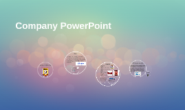
You're about to create your best presentation ever

Company Poster Powerpoint Template

Create your presentation by reusing a template from our community or transition your PowerPoint deck into a visually compelling Prezi presentation.

Mini-Poster Template

Transcript: Survivorship Curve Before and After Influenza Vaccine Cady Houghton Procedure Background Experimental Design Methods Research Question 1) A data base of cemeteries was looked up to find death dates and information. 2) From the data base information was put into a google drive document. 3) 40 people dying before the 1945 influenza vaccine were put into one chart showing the ages of death. 4) 40 people dying after the 1945 influenza vaccine were put into another chart also showing ages of death. 5) Both charts of groups of people were converted into a life history table. 6) From each life history table the data was put into another chart to make two survivorship curve charts. 7) The survivorship curve charts were put into one survivorship curve chart to show the difference in curves. A laptop was used for this lab. If the influenza vaccine works then if we compare the survivorship curve of before and after the vaccine it will show people living longer because the vaccine will be decreasing the death rate. The independent variable in this experiment is the influenza vaccine. The dependent variable is the death rate in this experiment. The exponential variables in this experiment are the other disease epidemics during the time period the data was chosen from. The control is the survivorship curve before the influenza vaccine and the experimental is the survivorship curve after the influenza vaccine. The survivorship curves of before and after the influenza vaccine was created are both Type I survivorship curves. They also have the caracteristics for K-selected species. While they are both Type I and K-selected species, the survivorship curve after the influenza vaccine was created had a decrease in death rates between 20 and 70 years of age of about .5 #/1,000 surviving. Then, towards the 75 and 90 years range, the #/1000 surviving leveled out and became extremely similar in curves. Did people die younger before the influenza vaccine was created? In comparing survivorship curves a Log10 scale is used for its ability to show you greater numbers in a more readable way and to show same mortality with the same curve when two scales are put together. In a Log10 scale there are three Types of information. The first, Type 1, are mainly humans. Type I survivorship curves are characterized by high survival in early and middle life, followed by a rapid decline in survivorship in later life. Type 2 is mainly birds and Type 3 is mainly reptiles. Within these Types are two categories of species, K-Selected, or Equilibrium, species and R-Selected, or Opportunist, species. K-Selected species usually have stable resources and a stable environment, and this is usually what humans are categorized as. R-Selected species are usually whose population size tends to fluctuate greatly in reaction to variations in the environment. Comparing the survivorship curves, defined as a graph showing the number or proportion of individuals surviving at each age for a given species or group cohort, before and after the influenza vaccine was created will show if the vaccine helped increase the population. Before the 1940s when the influenza vaccine was created, the epidemic was particularly deadly in US Army training camps, where the death rate was as high as 80% in some camps. Death rate is usually calculated as the number of deaths per one thousand people per year. usually calculated as the number of deaths per one thousand people per year. The US military was getting hit with influenza the most forcing them to developed the first approved vaccine for influenza, which was used in the Second World War. Studying this specific survivorship curve will also help to tell if their were more survival rates in the US military during the time. Results With the original research question in mind, before the influenza vaccine was created people were dying younger. This question was answered by the survivorship curve graph comparing the curves before and after the influenza vaccine. As the graph shows between 20 and 70 years of age there is a significant difference in curves, meaning that the death rate before the vaccine in that time period was increased more than after the vaccine was created. From that specific area of the graph it can be concluded that people were dying younger before the influenza vaccine was created, thus the hypothesis was correct. For future study it would be interesting to see the survivorship curve in the US military before and after the vaccine not just the population in general. Because the US military was the one who invented it because they were the one being impacted with the death rate from the influenza epidemic the most, the survivorship curve would have a chance of being more predominant. Graph Clear Digital Media, Inc. (1997-2011). Cemetery Records Online. October 1, 2013, www.interment.net Genealogical Gleanings. (1997-2004). Plagues and Diseases. October 3, 2013, genealogical-gleanings.com/Plauges.htm Introduction

Company PowerPoint

Transcript: I picked this company because Nestle is a Worldwide organization and you can find one at most of the malls you go to, and their food is amazing. Nestle Toll House Good Food, Good Life With instant coffee, baby food, and bottled water in the mix, Nestlé crunches more than just chocolate. The world's #1 food and drinks company in terms of sales, Nestlé is also the world leader in coffee (Nescafé). It also makes coffee for the home-brewing system, Nespresso. Nestlé is one of the world's top bottled water makers (Nestlé Waters), one of the biggest frozen pizza makers (DiGiorno), and a big player in the pet food business (Friskies, Purina). Its most well-known global food brands include Buitoni, Dreyer's, Maggi, Milkmaid, Carnation, and Kit Kat. The company also owns Gerber Products. North America is Nestlé's most important market. Why Nestle is better Baby foods Bottled water Cereals Chocolate & confectionery Coffee Culinary, chilled & frozen food Dairy Drinks Food service Healthcare nutrition Ice cream Petcare Weight management Competitors Mars, Incorporated DANONE MONDELEZ INTERNATIONAL, INC. Peter Brabeck-Letmathe (Chairman) Paul Bulcke (CEO) Wan Ling Martello (CFO) Brands Its most well-known global food brands include Buitoni, Dreyer's, Maggi, Milkmaid, Carnation, and Kit Kat. Anglo-Swiss Condensed Milk Company (1866) Farine Lactée Henri Nestlé (1867) Nestlé and Anglo-Swiss Condensed Milk Company (1905) Continued Nestle Toll House Why? Nestlé is the world's biggest food manufacturer, with almost 450 factories spread across the globe, and a portfolio that ranges from baby foods to pet care, from chocolate to mineral water. Its world-famous brands include Nescafe, Kit Kat and Perrier, among many others. The group also owns a large shareholding in cosmetics company L'Oreal. As with other food companies, recent years have seen a greater concentration on a focused food and beverage business. In particular Nestlé has leveraged its performance in sectors such as ice cream and petfoods with an aggressive acquisition strategy. At the same time, it has placed health and wellness at the forefront of its agenda, developing the widest possible range of nutritionally balanced products under the overall umbrella "Good Food, Good Life". See also Nestlé USA, Nestlé UK, Nestlé Australia, Nestlé Latin America and Nestlé Japan. Competition ...is committed to enhancing people's lives by offering tastier and healthier food and beverage choices at all stages of life and at all times of the day. Nestle is an overall amazing company that has all different kinds of food and brands. It has a few competitors but nothing too major that can tear apart the company. ...is committed to enhancing people's lives by offering tastier and healthier food and beverage choices at all stages of life and at all times of the day. Company PowerPoint Overview

Movie Poster Powerpoint

Transcript: Texture Form The color in this poster (also refered to as hue) is very well shown, and you can see what I mean when you look at the different lights in the picture and the colors of the titles. This is very important because it gives a whole different feel of the picture itself. The movie poster shows some balance. It shows it from how the car and the writing is specifically placed on the poster. 8 Elements of Design The eight principles of design will include; line, form, space, shape, texture, color, value, and tone. Form is shown in all the places where there is also some objects and where/how they are arranged. The three principles of Design will be explained to you in this order; balance, proportion, and unity. Description The value is also a thing that is shown very well, because you can see the degree of shadowing and different color brightnesses all around the poster. It is about many cars that compete against each other, and fight for a grand prize. I would say that proportion is shown in the way the car fills up the poster and stays strong. To me, the way that Lamborghini is placed gives me a good feeling about the car and how it would feel like to be in it. So, you can see all the textures on it and around the poster. For example the letters. In conclusion, all the objects and shapes are well fitted together, and placed to stay there peacefully. The Races Begin; Movie Poster Analysis By: Aleksandar Bogdanovic I guess that you could say that space is well used in this poster because in the areas where you see the writing meet with the car itself it looks kind of neat because the space is well used. The recommended rating would be around PG-14. Shape Space The line, that is shown in this movie poster is mostly where the car is touching the ground, but there is also some line used in, where the title and subheadings are. The way you can see this element is where and how the shapes are, and how they are placed there. You can see all the shapes is that Lamborghini and around it as well. 3 Principles of Design This element of design is kind of similar to Value, because it also is about the lightness and darkness in a picture. This one pertains to the lightness and darkness in all the ways you see lighter and darker things mostly in the upper section of this poster. Line Proportion Tone Color Value This movie is similar to the Fast and the Furious movie series; as a result, the genre would be considered to be a drama-action film. Unity Balance

Now you can make any subject more engaging and memorable