You're about to create your best presentation ever

Powerpoint Contents Page Template

Create your presentation by reusing a template from our community or transition your PowerPoint deck into a visually compelling Prezi presentation.

CONTENTS PAGE

Transcript: There is one main image used on the contents page which is a medium long shot of Lana Del Rey. This image takes up around a third of the page and is the only image apart from the picture of the editor therefore dominates the page. The image is anchored by a caption followed by the page number in a smaller font size in a different font color red. The use of a caption here is used to create an enigmatic tone to try and entice the readers to turn to the page which includes the feature of Lana Del Ray. IMAGE This image has been used to attract the target demographic that reads NME magazine. As the publishers have chosen to feauture an image of Lana Del Rey on the contents page because she is a young modern female artist therefore would appeal to a younger demographic as the readers can identify with the artists and see her as a role model and look up to her. Lana Del Ray could also attract more female readers to buy and read NME magazine as a female demographic may be attracted to Lana del Ray. CONTENTS PAGE ANALYSIS In the image Lana Del Rey is standing infront of a background which is a green hedge with vibrant red roses. The mise en scene of the background can connote a feel of love as stereotypically red roses are associated with feeling love and romance therefore this background could of been chosen to encourage the readers to see Lana Del Rey as a positive representation and feel love towards her and her "new album". The use of a natural background could also have been used to connote that the artists is a natural talent in comparison to more mainstream artists such as pop artists which are more artificial, therefore shows that the image mirrors the genre of music included in the magazine and that Lana Del Ray sings which is Indie rock and indie rock music is associated with artists that have an independent status rather than being owned and managed by a label. In the image of Lana Del Ray she is wearing a plain white top which could of been used to represent her as innocent and pure character this could be seen as a counter type as regally indie rock artists are seen to be wearing darker more grungy clothing however Lana Del Ray is presented looking more innocent and delicate standing in front of a colorful angelic background rather than the typical indie rock grunge background which tends to be darker, therefore Lana Del Ray can be seen as being represented positively. Lana Del Ray in the image is glancing to her left and is presented looking miserable. This shot could of been chosen to entice the readers and make them feel curious to find out why the artist is miserable and who she may be looking at, therefore this could entice them to turn to that page on the featured article.

Contents Page

Transcript: Contents Page The images used link to the genre of the magazine as the models are dressed in dark colours, which is typically indie as many of the artists are. Q has been represented as the bible, therefore suggesting that it is sacred. As he holds the book we see his hands are in a praying position also suggesting it's value. Ricky Gervais is dressed as a vicor but he's an atheist this links to Richard Dyer's theory of 'a star is a image not a real person, that is constructed'. Columns and Layout Font Style & Size The colour of the masthead breaks conventions within this contents page as there is usually a red box-out with a with on top Q. Another way they break conventions is because they never feature the date on the contents page. Q also use the same colour scheme of red, white and black. Lily Allen is dressed in black leather which is modern, this relates to the front cover as it's about her becoming an artist of different genre. Allen is posing in a shy way but as she is looking into the camera this looks seductive, this links with Laura Mulveys theory 'women are viewed for the pleasure of men'. The layout of the contents page is different throughout their magazines this is to keep it new and intriguing for the customer. Coloumns are used on this contents page to create an uncluttered effect. Colour The puffs are made bright and colourful as this links to the target audience which is young people. Cover Story Puffs Images The contents page has many images on, this appeals to a younger audience as this magazine aims to do. Also a collage has been used towards the right hand side this is because it features on band in particular. Research Contents 1 - Q Magazine The fonts within this article vary from sans serif to serif because this links to the different genres of the magazine. Uppercase lettering has been used to be distinct and capture the readers eye, this has been used on the main titles. Red has been used as it has connotations of danger, this links to the genre of the magazine as well as maintaining the house style.

Contents Page

Transcript: In my contents page i have not used columns therefore i have challenged this code and convention. Instead of using columns i decided to use bright boxes, this is because i saw this in another pop magazine and believed that it would make the information on the page easier too read. Also, as i have used boxes that do not contain loads of information like most columns do it would suit my specific target audience who may not have the time to read loads of information they are not interested in, this allows the audience to quickly see the information they are interested in and go straight to the pages which they want to read about. Smaller Version Of Front Cover I have included the page numbers in a pink box, this is too keep in with the same colour scheme as the rest of the magazine. These page number boxes are also used on the bottom of the double page spread. I have used many different images on the contents page in order to show the different artists which are represented in the magazine. Using images is also more likely to keep the readers attention as there is not too much information distracting them. Title Contents Page Typically, pop magazines have the title at the top of the page in a large font which stands out. Thus, i have followed the codes and conventions with this specific aspect. However, most magazines simply state "contents" and use this as a title whereas I added a more personal touch. I done this as i saw it in an actual pop magazine and felt that it would be something which stands out to my target audience. I have used colors which are within my color theme but still stand out too an audience. I have incorporated my magazines masthead in with the title, this is too keep another key code and convention in place which i have developed to suit my own magazine. This is to use a smaller version of the masthead on the contents page, this also gives my magazine identity. Categories I have broke the convention of having a main image that is related to the cover story which is on the front page. I have done this as i have included many different aspects such as a smaller version of my front cover which may interest the specific target audience more then another image of the model might. I got the idea to do this from an actual pop magazine which has a similar target audience to mine. Although i have not used a main image i have used other images that would interest the specific target audience This is a title from a top of the pops magazine which gave me the idea to do something like it in my own magazine. Most magazines incorporate a smaller version of the front cover on the contents page. However i have developed this convention and used in a such a way where the smaller front cover is used to direct the audience to the stories which are on the front cover. I decided to develop this convention as i believe that my target audience would like to quickly see where the articles they are interested in on the front page are situated. Colour Scheme Mix Images&Page Numbers I have included Categories for each different section on my contents page, this is too make it easier for the reader to see the section which they are most interested in reading. Using the white for the text drags the readers attention to the categories but at the same time it allows the more important features such as the page numbers and images to stand out more. Contents pages often use a mix of both images and text in order to make the page more appealing for the reader. I have incorporated this idea into my own contents page and have used a variety of images and text in order to keep the readers attention on the magazine and too stop them getting bored. The colour scheme of my contents page is Purple, pink, and White. I have used these colours in order to make sure that the front page and contents page match in order to create a house style for my magazine. I have used these specific colours due to the connotations which they promote fit the target audience. The boxes used allow the audiences attention to be bought to the important information on the page. I have used the same background as on the front page as too yet again create a house style for my magazine and to create an identity for my magazine which would make it easier for the audience to identify my magazine Main Image In what ways does your media product use, develop or challenge forms and conventions of real media products? Columns

Contents page

Transcript: Colour Scheme Columns I have followed conventions by making the colour scheme of my contents page match my front cover. A mixture of Red, grey and Black In what way does your magazine use, develop or challenge forms & conventions of real media products? Sub-lines The majortiy of magazine contents pages are laid out in columns and i too have followed this convention. The reader should acknowledge and appreciate this as it makes it easier to read and understand. The title has kept the conventions of having the biggest font on the page. I used a unique Sans Serif font, which would display the modern feel from the magazine. It is placed on the top right of the page, fitting in to a box, following conventions of a real magazine and i kept it within the colour scheme for the magazine Mix My front cover model is also the main image of my contents page. He has the biggest image amongst the other pictures on my contents page as the main article is about him. I had challenged conventions by not including a costume change between the front cover and contents page. Sub-lines are text with smaller and less appealing fonts that explain specific details about what the main article is about. I have slightly challenged this convention as my information only mentions that the article is based on 'behind the scenes'. Main Image Every single magazine includes a small version of it's front cover masthead on the contents page. I have followed the conventions of this and placed my masthead in the very top left corner, so its noticeable but not detracting from any info on the contents page. Ive also included a smaller version of my Front Cover over the title, but done in a way where the title 'Contents' is still readable. Masthead Contents page should include a mix of pictures/phots, headings and text boxes. A minority of contents pages are 2 pages long but ive stuck to the conventions and kept to one page. I have used a varitey of pictures and fonts to make my C.P attractive. Looking at other hip hop magazine contents pages('The Source', 'Vibe'), i've discovered the majority of them do not follow conventions within their mix such as not having boxes within the page. This gives me the sense that they have challenged the conventions Title

Contents page

Transcript: The contents page is very simplistic, and XXL issues there is never much writing it’s very minimalistic. There is usually a white or grey background with a bold heading such as the A-side. The contents page usually has a picture of an artist or two and the writing either on the left or the right hand side. The colour scheme is very fluent and allows for an easy read with a font that is easy to understand. The strips of black under the masthead and under the image are maintained throughout every issue meaning customers become very familiar with XXL layout. The masthead maintains the XXL hip hop roots with the A- side. The magazine also has a general theme that runs through all of there magazine and that is the black, red and white colour scheme, the other colour comes from the images itself the rest is very minimalist. Textual Analysis of Vibe magazine and XXL magazine Contents page Textual Analysis The background of the contents page there is a large 'V' which represents the magazines title Vibe. The V doesn't just represent the title it also looks stylish and matches the photo. The contents page is quite empty with little text and a big image. However this simplicity creates a smart look and feel to the magazine. The colours scheme is very simple again creating a classy look. Moreover vibe has used a touch of red in the image. This makes the image seem more intresting and also draws the readers attention as there is a contrast in colour. Down the right hand side are listed page numbers. They are split into catagories: features and fashion showing the magaizne is targeted towards more then one audience. Aditionaly the word contents has been broken up into 3 sections, this makes the contents page look diffrent and gives the magazine a form of uniqueness. XXL magazine Vibe magazine

Contents Page

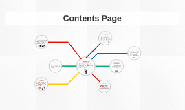
Transcript: Introduction Columns The contents page of my magazine (Mainstream) uses, develops and challenges typical conventions found on other magazine via title, layout, subscription box, etc. Contents Page My contents page has three columns, that are all of equal size, this is not conventional of contents page in this genre of music, however in some that I have analysed an image will usually take up most of the columns with an image, if not an entire page. The company does not appear on my contents page however it does conventionally on real media products, for example in appears in the footer on XXL. Subscription Box These are conventional on contents pages so I decided to use them on my contents page in between the columns, both of equal size, this is conventional among other magazines such as, XXL and The Source. Baseline/Footers My baseline contains social media links from my magazine including facebook, twitter, instagram and youtube. This is where I challenged conventions as they are not usually used. My footer contains the website address, magazine logo, issue date and also the page number which is conventional of footers in real media products, as shown in examples below. Alley/Gutter The images that I used on my contents page are both medium close-up which is conventional of what is normally used in real media products and also mise en scene used again to show male dominance and control, stereotypical for real media products, e.g. XXL and The Source. On my contents page I added a subscription box, which is challenging conventions of real media products in this category of music magazines, e.g. XXL and The Source. I decided to use mine to catch the eye of the reader and increase publicity in the first months of my magazines circulation. Hopefully encouraging people to buy it every month. The titles that I used spans the whole page and also uses the same font as the masthead on the front cover, this is conventional in real media products. The subheads that are used on my contents page are conventional also as they split the page in sections and are the same size throughout, examples shown below. Subheads/Titles Image/Captions Institutional Conventions

Now you can make any subject more engaging and memorable