You're about to create your best presentation ever

Poster Presentation Empty Template

Create your presentation by reusing one of our great community templates.

Empty Presentation Template

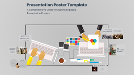
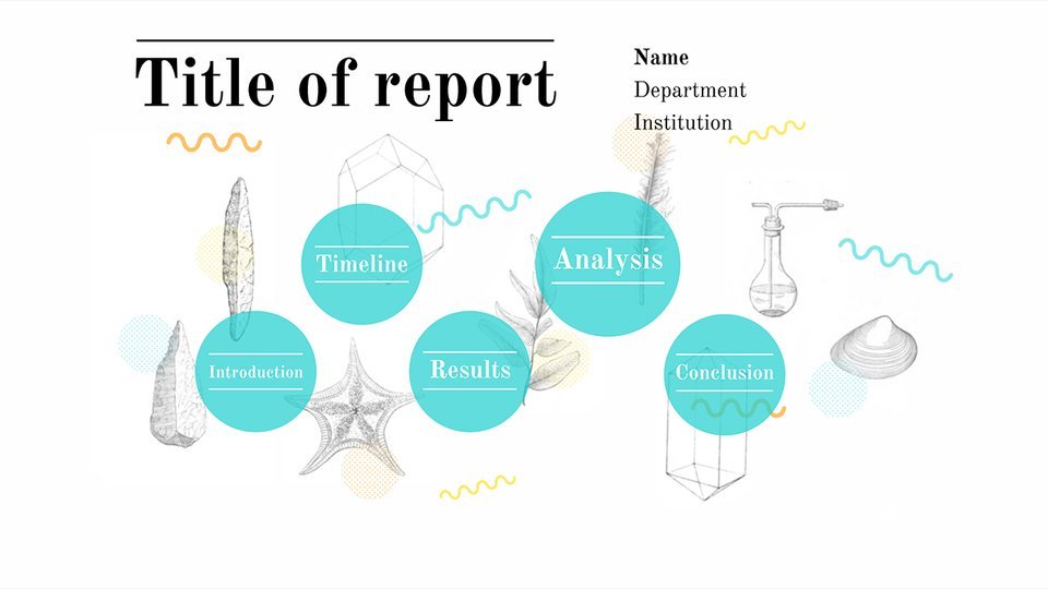
Transcript: Empty Presentation Template A 15-Slide Framework for Your Content Introduction Overview of the Template The empty template consists of 15 slides, designed for customization. It allows presenters to efficiently organize their thoughts and information. Target Audience Purpose of the Presentation Template The template is designed for corporate professionals, educators, and students who need to present ideas systematically. It caters to varied presentation settings, from conferences to classroom environments. The primary purpose of the template is to facilitate clear communication of ideas. It serves as a consistent format that enhances audience engagement and understanding. How to Use the Template The template should be filled by following the suggested layout without altering the structure. Customization can include adjusting text, images, and data relevant to the specific topic being presented. Benefits of Using a Structured Template Using a structured template streamlines the presentation creation process. It fosters clarity, maintains focus, and reduces cognitive load for both presenters and audiences. Slide Breakdown Customization Tips Title Slide Agenda Slide Content Slide 1 Editing Content Effectively The Title Slide introduces the presentation's topic and the presenter. It should include the title of the presentation, the presenter's name, and the date, setting the tone for the audience's expectations. Content Slide 1 serves to present the first major point of the presentation. It should include a clear heading, concise bullet points, and any relevant visuals to support the information being conveyed. The Agenda Slide outlines the main topics that will be covered during the presentation. This gives the audience a roadmap of what to expect and helps maintain focus throughout the session. Design and Aesthetic Choices Content should be concise, relevant, and targeted to the audience. Utilize bullet points for clarity, and avoid excessive text. Prioritize the most critical information to maintain focus and engagement throughout the presentation. Chart/Graph Slide Selecting a coherent design style is paramount for visual appeal. Opt for templates that align with themes, such as modern, minimalistic, or classic. Consistency in design across slides establishes a polished look, promoting audience focus. Content Slide 2 Image Slide The Chart/Graph Slide visually represents data through graphs or charts. This aids in illustrating trends or comparisons effectively, making complex information more accessible for the audience. Content Slide 2 continues the discussion with another key point, elaborating on a different aspect of the topic. It should maintain a consistent format and include supportive data or imagery to enhance understanding. The Image Slide showcases relevant visuals that support the narrative. High-quality images can invoke emotional responses or provide clarity to the points made earlier in the presentation. Best Practices for Visuals and Graphics Incorporating Brand Elements Q&A Slide Conclusion Slide Thank You Slide Visuals should complement and enhance the narrative, not overwhelm it. Use high-quality images, infographics, and data visualizations to convey complex information clearly. Consistency in style across visuals is essential for professionalism. Brand elements, including logos, color schemes, and typography, should be seamlessly integrated into templates. This ensures presentations reflect brand identity and values, fostering recognition and connection with the audience. The Q&A Slide invites audience questions to clarify any uncertainties or engage in further discussion. This is vital for feedback and deepening the interaction between presenter and audience. The Conclusion Slide summarizes the key points discussed in the presentation and reinforces the overall message. It serves to remind the audience of the main takeaways before addressing any questions. The Thank You Slide expresses appreciation for the audience's time and attention. This slide often includes contact information for follow-up discussions or inquiries post-presentation. Additional Resources Slide Conclusion of Customization Tips The Additional Resources Slide provides links or references for further information relevant to the presentation topic. This helps audience members seek out more knowledge after the session. Choosing the Right Fonts and Colors Effective customization integrates design, branding, and content editing for a cohesive presentation. Prioritizing audience engagement through tailored elements can significantly enhance the overall impact of the presentation. Font selection is crucial for readability and tone. Use 1-2 complementary fonts and a cohesive color palette to enhance visual impact. Ensure high contrast between background and text for clear communication.

Empty Presentation

Transcript: Overview Introduction The overview provides a framework for understanding the entire presentation, establishing key themes and objectives. It serves to align the audience with the presented content and direction. Purpose Empty Presentation The purpose of this presentation is to convey essential information and insights derived from the provided content. It aims to inform decision-making and drive conversations around the main topics discussed. Scope This presentation encompasses various aspects from the provided content, including analysis, insights, and recommendations. It aims to cover the most relevant themes that support informed decision-making. No content available for elaboration Conclusion Summary This presentation encapsulates the core findings, revealing key themes that emerged from the analysis. The insights drawn provide a holistic view of the overall situation and potential impacts on future initiatives. Future Work Future efforts should concentrate on continuous monitoring of the discussed themes and the integration of new insights as they arise. Establishing a framework for adaptive strategies will ensure responsiveness to changing conditions. Recommendations Based on the analysis, it is recommended to implement targeted strategies focusing on the identified themes. Additionally, fostering collaboration between stakeholders will enhance engagement and improve overall outcomes. Content Analysis Key Findings Identified Themes The analysis revealed significant trends that indicate a shift in user preferences and behaviors. Notably, the data pointed to an increase in demand for personalized experiences, suggesting that businesses must adapt to meet these evolving expectations. Several recurring themes emerged from the analysis, including sustainability, innovation, and technology integration. These themes highlight the areas where organizations should focus their strategic efforts moving forward. Strategic Insights The insights gathered suggest that organizations are well-positioned for growth if they leverage technology effectively. Furthermore, adapting to consumer feedback will enhance engagement and loyalty in their target markets.

Presentation Poster Template

Transcript: Presentation Poster Template A Comprehensive Guide to Creating Engaging Presentation Posters Introduction to Poster Presentation A poster presentation is a visual communication tool used to convey information about a specific topic, research, or project. It serves as a vital method for sharing ideas and findings in academic and professional environments, allowing for engagement and discussion with the audience. "Questions are the engines of intellect." The Importance of Questions Title Abstract The abstract summarizes the key points of the research, providing a snapshot of the study's purpose, methods, results, and conclusion in a brief format. A concise and descriptive title serves as the first impression of your poster, capturing the essence of the research and engaging the audience's interest. Conclusion and Best Practices Introduction Methods Key Components of a Poster The introduction provides necessary background information that sets the context for the research, outlining its significance and objectives. The methods section details the approach and procedures followed during the research, allowing others to understand and replicate the study. Results Conclusion Creating an impactful poster presentation requires attention to both content and design. By focusing on essential elements and following best practices, presenters can effectively communicate their research and engage their audience. The results section highlights key findings, often using graphs, charts, or images for visual representation to make data easily digestible. The conclusion summarizes the main findings, discussing their implications and significance, and often suggests areas for future research. Overloading with text Poor image quality Common Mistakes to Avoid Inconsistent formatting Utilize ample white space Ignoring audience engagement Design Tips for Effective Posters Incorporate visual hierarchy Select appropriate fonts Limit color palette Use bullet points strategically

Mini-Poster Template

Transcript: Survivorship Curve Before and After Influenza Vaccine Cady Houghton Procedure Background Experimental Design Methods Research Question 1) A data base of cemeteries was looked up to find death dates and information. 2) From the data base information was put into a google drive document. 3) 40 people dying before the 1945 influenza vaccine were put into one chart showing the ages of death. 4) 40 people dying after the 1945 influenza vaccine were put into another chart also showing ages of death. 5) Both charts of groups of people were converted into a life history table. 6) From each life history table the data was put into another chart to make two survivorship curve charts. 7) The survivorship curve charts were put into one survivorship curve chart to show the difference in curves. A laptop was used for this lab. If the influenza vaccine works then if we compare the survivorship curve of before and after the vaccine it will show people living longer because the vaccine will be decreasing the death rate. The independent variable in this experiment is the influenza vaccine. The dependent variable is the death rate in this experiment. The exponential variables in this experiment are the other disease epidemics during the time period the data was chosen from. The control is the survivorship curve before the influenza vaccine and the experimental is the survivorship curve after the influenza vaccine. The survivorship curves of before and after the influenza vaccine was created are both Type I survivorship curves. They also have the caracteristics for K-selected species. While they are both Type I and K-selected species, the survivorship curve after the influenza vaccine was created had a decrease in death rates between 20 and 70 years of age of about .5 #/1,000 surviving. Then, towards the 75 and 90 years range, the #/1000 surviving leveled out and became extremely similar in curves. Did people die younger before the influenza vaccine was created? In comparing survivorship curves a Log10 scale is used for its ability to show you greater numbers in a more readable way and to show same mortality with the same curve when two scales are put together. In a Log10 scale there are three Types of information. The first, Type 1, are mainly humans. Type I survivorship curves are characterized by high survival in early and middle life, followed by a rapid decline in survivorship in later life. Type 2 is mainly birds and Type 3 is mainly reptiles. Within these Types are two categories of species, K-Selected, or Equilibrium, species and R-Selected, or Opportunist, species. K-Selected species usually have stable resources and a stable environment, and this is usually what humans are categorized as. R-Selected species are usually whose population size tends to fluctuate greatly in reaction to variations in the environment. Comparing the survivorship curves, defined as a graph showing the number or proportion of individuals surviving at each age for a given species or group cohort, before and after the influenza vaccine was created will show if the vaccine helped increase the population. Before the 1940s when the influenza vaccine was created, the epidemic was particularly deadly in US Army training camps, where the death rate was as high as 80% in some camps. Death rate is usually calculated as the number of deaths per one thousand people per year. usually calculated as the number of deaths per one thousand people per year. The US military was getting hit with influenza the most forcing them to developed the first approved vaccine for influenza, which was used in the Second World War. Studying this specific survivorship curve will also help to tell if their were more survival rates in the US military during the time. Results With the original research question in mind, before the influenza vaccine was created people were dying younger. This question was answered by the survivorship curve graph comparing the curves before and after the influenza vaccine. As the graph shows between 20 and 70 years of age there is a significant difference in curves, meaning that the death rate before the vaccine in that time period was increased more than after the vaccine was created. From that specific area of the graph it can be concluded that people were dying younger before the influenza vaccine was created, thus the hypothesis was correct. For future study it would be interesting to see the survivorship curve in the US military before and after the vaccine not just the population in general. Because the US military was the one who invented it because they were the one being impacted with the death rate from the influenza epidemic the most, the survivorship curve would have a chance of being more predominant. Graph Clear Digital Media, Inc. (1997-2011). Cemetery Records Online. October 1, 2013, www.interment.net Genealogical Gleanings. (1997-2004). Plagues and Diseases. October 3, 2013, genealogical-gleanings.com/Plauges.htm Introduction

Creating an Empty Template

Transcript: Benefits of Starting from Scratch Beginning a project with an empty template allows for personalized customization, tailored to specific needs and preferences. It encourages originality, problem-solving, and the development of unique solutions. Creating an Empty Template Applications of Empty Templates Empty templates are versatile tools used in various industries, from graphic design and web development to project management and content creation. They streamline processes, enhance consistency, and facilitate efficient project execution. Collaborative Template Creation Use Cases for Blank Templates Importance of a Blank Canvas Encouraging collaboration in template creation fosters innovation, diversity of ideas, and collective ownership, leading to more versatile and effective templates. Introduction to Creating Empty Templates An empty template offers a fresh start, fostering innovation and originality in every project. It provides the freedom to explore new ideas without constraints or preconceptions. Blank templates are ideal for creating standardized documents, designs, or processes that require consistency and efficiency. They are often used for project planning, brainstorming, data organization, and collaborative endeavors. Designing a Blank Canvas for Your Project A blank canvas holds the key to limitless creativity and productivity. Embrace the freedom of starting with a clean slate. Tracking and Evaluating Template Usage Setting up Guidelines and Standards Establishing clear guidelines and standards for using empty templates can ensure consistency, branding, and efficiency across projects and teams. Implementing systems to track template usage provides valuable insights for improvement, user feedback, and optimization of templates based on actual usage data and trends. Integration into Workflows Implementing and Utilizing Empty Templates Effectively integrating empty templates into workflows requires aligning with existing processes and addressing specific needs of users and teams. Integrating blank templates into existing workflows can streamline processes and enhance productivity. Combining images for designing effective templates Customization Options Best Practices for Template Design Click to add text Following best practices in template design ensures consistency, usability, and scalability, leading to enhanced user adoption and satisfaction. Enhancing Efficiency Through Collaboration Providing customization options allows users to tailor the empty template to their specific needs and preferences, enhancing its versatility and usability. Collaborative template creation leads to innovative solutions, incorporating diverse perspectives and improving overall efficiency in project workflows. Incorporating Essential Elements Ensuring User-Friendliness Designing an Effective Empty Template Including key elements in the template ensures it fulfills its intended purpose and provides value to users from the start. Ensuring user-friendliness in template design involves simplifying the interface, navigation, and instructions, making it easy for users to interact with and utilize the template effectively. Creating a well-thought-out layout and structure is essential for an empty template to serve its purpose effectively. Layout and Structure The layout and structure of an empty template play a crucial role in guiding users and organizing content efficiently. Introduce your first point This is where your presentation starts. Provide context for your audience and make it easy for them to follow. Closing the presentation Summarize each point you made Give quick call-backs so your audience remembers Make it clear this is the end Follow up with another point Keep your words short and punchy so your audience stays focused. You can add imagery and frames to keep their attention where you want it. Put a bold statement here Put something fun or important here Write something high-impact about this photo Use this space for details that you haven’t talked about yet. Relate what you’re saying to the nearby image so your audience has a visual, too.

Poster Template Design

Transcript: Introducing the 70x140 cm Poster Template This presentation outlines the features of a poster template specifically designed in the dimensions of 70x140 cm, focusing on its purpose and the advantages it offers for effective communication in various contexts. Enhanced Visibility The 70x140 cm size ensures that the content is easily readable from a distance, making it perfect for crowded environments like exhibitions and conferences. Optimal Size Key Benefits of 70x140 cm Size This size strikes a balance between large enough to attract attention and small enough for easy transportation, making it versatile for various uses. Effective Layout The dimensions allow for effective layout of textual and visual elements, facilitating better audience engagement and comprehension of the information presented. Poster Template Design Design Elements Engaging Visuals Concise Text Strong Headline Engaging visuals such as images or graphics enhance understanding and retention of information. Concise text ensures clarity and allows viewers to quickly understand the key points without overwhelming them. A strong headline grabs immediate attention and conveys the main message effectively. Creating an Effective 70x140 cm Presentation Poster Marketing Events Academic Presentations In marketing events, the same template serves to highlight product features, promotional messages, and branding elements. Its size ensures that key visuals and texts attract potential customers' attention, creating an engaging display. The poster template is highly effective for academic presentations, where it can showcase research findings, data, and scholarly insights. This size allows for detailed graphs and text that cater to an academic audience. Evolution of the 70x140 cm Poster Template Tracking the development and versatility of the poster template across different applications and fields. Marketing Adoption Current Trends Initial Design The template began to see broader applications in marketing events, adapting to the needs of showcasing products. Modern iterations of the template now incorporate digital elements and interactive features to enhance communication. The 70x140 cm poster template was first introduced, focusing on basic design principles for academic use. Enhanced Features Future Directions The template was updated to include engaging visuals and layout adjustments to improve audience engagement. Looking ahead, the template is expected to evolve with trends in design and technology, catering to diverse fields.

Empty template

Transcript: Norway Main hotel chains ??? Oslo SUPERIOR Standard Hotel group Hotel name Hotel 1 (picture of hotel here) Allotment How many rooms in total Room types/how many if available Bathtubs/Kettles in rooms Other relevant information ROOMS Hotel name Hotel 2 Hotel group Allotment ROOMS Hotel 3 Infromation Hotel Name Hotel 4 Hotel group Allotment how many rooms types kettles/bathtubs other ROOMS SUPERIOR Superior Allotment Tumlare Scandic Copenhagen Located in central Copenhagen Stunning views over the water and Copenhagen city One of Copenhagen's largest conference centers 24h reception Garage Free wifi Tivoli amusement park, Nyhavn and Strøget shopping street are all within a walking distance from the hotel. Scandic Copenhagen 486 rooms 102 single 96 twin 95 family rooms Rooms for disabled Bathtubs/kettles??? All rooms include Ironing board and a safebox ROOMS 7 minutes by walking from the old city center Nearest train station Vesterport 1 min by walking Restaurant and bar Imperial Hotel Allotment Tumlare - ARP Hansen Hotels Imperial Hotel Hotel room capacity: 304 Air conditioning Free wifi The hotel has allergy friendly rooms Rooms have bathtubs with a shower Coffee and tea making possibilities ROOMS Copenhagen Island Copenhagen Island is situated next to the harbor Porter service available from 7 am to 10 pm Free WIFI and Air conditioning 24h reception A la carte restaurant & bar 2 km from the city center Allotment Tumlare - ARP Hansen Hotels Copenhagen Island Hotel room capacity 326 Standard twin rooms 61 Superior twin rooms 4 Executive twin rooms 6 3 junior suites and one junior suite de luxe The hotel has allergy friendly rooms bathtubs/kettles??? ROOMS DELUXE Deluxe New Scandic Hotel opens 7th Semptember 2018 Located on the ultra-hip meatpacking district of Copenhagen 2 km from the old city center Free wifi Nordic design interior Scandic Kødbyen Scandic Kødbyen Allotment Tumlare Exclusive Standard ?? superior ?? superior extra ?? junior suite ?? master suite ?? Bathtubs ?? Kettles ?? All with possibility for double or twin beds ROOMS Located close to water 1,6km from the city center Free WIFI Reception 24 hours Restaurant & bar Indoor Pool Tivoli Hotel Tivoli Hotel - ARP Hansen Hotels Allotment Tumlare Standard single/double ?? Superior single/double ?? Superior King ?? Executive ?? Junior Suite ?? Suite ?? Allergy- and handicapfriendly rooms Rooms with coffee/tea equipment Bathtubs ?? ROOMS SKT. Petri Hotel Skt Petri Located right in the middle of the old city centre Closest station Nørreport Porter service available 06:00-01:00 Full service spa Nordic Choice Hotel room Capacity: 268 Family rooms: 12 Standard rooms (20​-24 m²) feature a king sized bed and a street or a courtyard view.​ All rooms have a minibar safety box free Wifi iron board + iron hairdryer ROOMS Copenhagen has a large business district around the old city center. Our key hotels in the area are all well connected to the city, and offer facilities for events up to hundreds of people. City limit hotels City Limit hotels Standard STANDARD SUPERIOR Superior Allotment Tumlare Scandic Sydhavn Scandic Sydhavnen Located on the business district of Copenhagen 4 km from the city center Multiple buses and a regional train connect the hotel well to the city Free parking Meeting room facilities for up to 400 people Free wifi Hotel room Capacity: 391 Standard twin rooms with bath tube 10 Twin superior rooms with bath tube 57 standard family rooms 35 Superior family rooms 8 Kettles in superior rooms ROOMS AC hotels Bella Sky Bella Sky Allotment Kuoni Located in the modern design and business district of Ørestad 5km from the city center, 7 minutes in a metro. Hotel has its own metro- and bus stop 10 minutes to the airport One of regions largest conference center Bella Center is in the building 48 flexible rooms and auditoriums with capacities up to 930 people Shuttle service to-from airport Hotel room Capacity 812 Twin room capacity 540 Family rooms: None, but possibility for extra beds Handicap friendly rooms 7 Coffee maker / tea service Iron and ironing board Bathtubs??? ROOMS DELUXE Deluxe 3 minutes walking from CPH terminal 3 12 minutes to the city center by train or metro Conference center Bella Center is conveniently located two stops away Meeting and conference facilities for up to 500 people Clarion Airport Hotel Clarion Airport Nordic choice Allotment Tumlare Hotel room capacity 382 standard twin rooms capacity with bath tubs and shower 86 Family rooms 12 Handicap friendly rooms 4 ROOMS Denmark consists of the mainland Jylland, and many islands. Copenhagen is located on the most densily populated one called Sjælland. Smaller towns around the capital have a lot to offer, varying from history to business possibilities. Outside of Copenhagen Outside destination/other destination STANDARD Standard Allotment Kuoni Comwell Roskilde Comwell Roskilde Located in the historical town of Roskilde, the former capital of Denmark Close to small forests and water

Now you can make any subject more engaging and memorable