You're about to create your best presentation ever

Logo Concept Presentation Template

Create your presentation by reusing one of our great community templates.

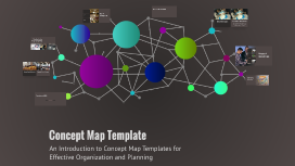
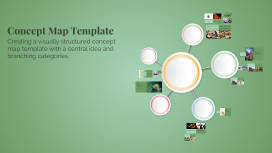
Concept Map Template

Transcript: Steps to Create a Concept Map A structured approach to developing concept maps for effective knowledge organization. Step 1: Identify Main Idea Step 2: Brainstorm Related Concepts Step 3: Organize Hierarchically Step 4: Connect Concepts Begin with a clear main idea that serves as the central theme of the concept map. Arrange the concepts in a hierarchical structure, placing broader categories at the top and more specific details below. Generate a list of concepts that connect to the main idea, considering all relevant associations. Draw lines between related concepts and label them to explain the connections, helping to clarify relationships. Connecting Lines: The Relationships Nodes: The Concepts Connecting lines serve to illustrate the relationships between the nodes. These lines can often be labeled to provide clarity on how the concepts are related, enhancing the map's overall meaning and functionality. Nodes are the fundamental units of a concept map, representing individual concepts or ideas. They can contain textual elements such as words and phrases or graphical elements like images, making them versatile for different contexts. Hierarchical Maps Hierarchical maps organize information in a top-down structure, showcasing the relationship between a main idea and its sub-concepts. This format is useful for depicting categories and classifications. Spider Maps Types of Concept Maps Spider maps, also known as web maps, start from a central idea and branch out to related concepts. This format helps in brainstorming and showing connections among various ideas. Flowcharts Flowcharts are used to represent processes or workflows. They utilize shapes and arrows to indicate the flow of steps, making complex processes easier to understand. Understanding Concept Maps Concept maps are effective tools that visually depict the relationships and hierarchies between different concepts. They play a crucial role in organizing information, making it easier to understand and remember complex ideas. Enhance Understanding Concept Map Template Concept maps help learners visualize relationships between concepts, leading to deeper understanding and retention of information. Facilitate Brainstorming Purpose of Concept Maps They provide a framework for brainstorming, allowing individuals to explore and connect ideas more effectively during the learning process. Promote Active Learning Concept maps promote active learning by encouraging students to engage with the material, fostering critical thinking and problem-solving skills. Enhancing Learning through Concept Maps Concept maps significantly improve learning outcomes by facilitating better understanding, promoting critical thinking, and enhancing problem-solving skills. They also foster active engagement and collaboration among learners, making the learning process more dynamic and interactive. An Introduction to Concept Map Templates for Effective Organization and Planning Concept Maps in Business Concept Maps in Education In the business realm, concept maps serve as effective tools for project planning and strategy formulation. They help teams clarify objectives, outline processes, and communicate ideas, ultimately leading to improved collaboration and decision-making. In education, concept maps are instrumental in enhancing teaching methodologies and evaluating student understanding. They allow educators to visualize concepts and demonstrate the connections between different topics, facilitating deeper learning. Conclusion and Q&A Summarizing the key takeaways on concept maps and inviting questions from the audience. Key Takeaway Concept maps are effective for knowledge organization across different fields.

Logo Presentation

Transcript: History of Apple 1998-Present Closure 2nd Logo 1st Logo In 1996-1997 they lost a lot of money & Steve came back. The first logo was designed in 1976 by Ronald Wayne (The 3rd Co-Founder of Apple. Logo name: The Newton Crest 1976-1976 In the logo is Isaac Newton sitting under a tree and a apple dangling above his head. There was no rhyme or reason behind the placement of the colors. Scully and Jobs got into a argument and jobs resigned. Logo Presentation By: David Lopez The bite in the apple was made to let people know it was a apple and not a tomato. Citations The Apple logo was already recognized worldwide so they decided to change it. They thought the rainbow apple looked out of place and wouldn't look good on the newer model computers and other electronics by Apple. Steve Jobs & His friend built a apple computer & it was a success. Jobs invited Scully 'president of Pepsi-Cola' and he became president and CEO of Apple. 1976-1988 In my opinion the new logo looks a lot better than the first one because its a lot more simple and more professional and the second logo just looks off and unprofessional because of all the colors. 3rd Logo Evolution of apple computer http://www.edibleapple.com/2009/04/20/the-evolution-and-history-of-the-apple-logo/ Apple History http://www.apple-history.com/ Thirty Years of Apple https://www.apple.com/30-years/ "Edible Apple." The Evolution and History of the Apple Logo | . N.p., n.d. Web. 08 Sept. 2014. "Recent Changes." Apple-history.com / Specs for Every Apple Computer, Established 1996. N.p., n.d. Web. 08 Sept. 2014. "Happy Birthday, Mac." Apple. N.p., n.d. Web. 07 Sept. 2014. Today's Apple Logo After he came back they did very well and they had a lot of sales. Rainbow Apple History of Apple

Logo Concept Presentation

Transcript: Logo Breakdown Typography Color Palette The typography features a modern sans-serif font that ensures legibility and reflects a contemporary brand image. It was chosen for its clean lines and professional appearance, aligning with the forward-thinking objectives of the company. The color palette consists of three primary colors: blue for trust, green for growth, and orange for creativity. These colors are strategically chosen to resonate with the company’s values and target audience, aiming to evoke specific emotions and brand recognition. Symbolism and Imagery Shape and Form Logo Introduction The logo incorporates a unique symbol that represents collaboration and innovation. This imagery captures the essence of the company's mission to foster teamwork and creativity among its stakeholders. The logo’s shape is a combination of circular and angular elements, signifying balance and stability. This dynamic yet harmonious design reflects the company's commitment to maintaining a solid foundation while pursuing innovative strategies. Overview of the New Logo The new logo combines contemporary design elements with classic principles. Its simplicity and elegance aim to establish a strong visual presence in a crowded industry. Expectations from the New Design Importance of a Strong Logo The new logo is expected to resonate with our target audience, blending modern aesthetics with functional design. Feedback indicates a need for versatility across various platforms and applications. A robust logo is critical as it serves as the face of the company, fostering brand recognition and trust. It differentiates the business from competitors and communicates core values at a glance. Logo Concept Presentation Conclusion Future Applications of the Logo Recap of Key Points The logo will be integrated across various platforms including our website, social media channels, and physical products. Its flexibility allows for consistent branding, enhancing recognition and loyalty among customers. The new logo emphasizes our brand's modern identity, effectively combining unique typography and a vibrant color palette. Its design reflects our core values and mission, creating a memorable visual identity for customers to connect with our brand. Call to Action for Feedback Gathering feedback on the logo will provide insights for further refinement and improvement. Stakeholder input is crucial for ensuring that the logo resonates well with our target audience and aligns with our brand goals. Breakdown of the New Company Logo with Real-World Examples Real-World Examples Business Cards Application Merchandise and Branding The logo prominently displayed on business cards ensures immediate brand recognition. Incorporating the chosen color palette and typography reinforces consistency and professionalism in networking situations. The logo’s application on merchandise, such as apparel and promotional items, amplifies brand visibility and loyalty. Consistently branded products promote recognition and engage consumers positively. Website Integration Social Media Presence Integrating the logo into the company website enhances visual identity and creates a cohesive user experience. Placing the logo in the header ensures it is visible on all pages, promoting brand consistency. Utilizing the logo across social media platforms solidifies brand identity online. A consistent visual style aids in audience engagement and fosters brand recognition in digital interactions.

Logo Presentation

Transcript: As you can see i had to rotate the image and after that, i cut it into shape and put the wording onto it. I decided to keep it black and white, as i feel it suits the feel of the image and putting colour onto may make it look odd. Logo Proposal This is my 2nd logo design for our company Perfect Pixels co.I intend to make this a simple drawn up design, which will be eye catching and blend in with alot of well known brands, In terms of my design and the way the logo is structured. I believe the logo with appeal to all people, it may grab the attention of a more mature audience due to the simplicity and seriousness of my design. but it will also appeal to all age groups.The logo will be for a media company and i will make that clear by adding media to the logo name, So on the logo it will be written as PPM.co.Which means Perfect Pixels Media co,That could be the website address and the letters PPM in itself could attract some views as it may be a little puzzle for some,as they may try guessing what the letters actually stand for. I choose to use a shield with wings and rays of the sun around it and a headers bar at the bottom to write the title of the company.In the shield i will insert the image of a Chameleon with its tongue sticking out.I choose the shield because i think its shows signs of seriousness and will be easy to identify as a logo as alot of logos tend to have shields.I believe the wings make the design eye catching and give the image a different meaning and more appeal,For example to a kid it may capture their imagination.The rays of the sun around the shield i feel brighten up the design and gives it a sophisticated look which i want people to expect and associate with our company. Also the Chameleon in the shield stands for natural and adaptable qualities which are quite important in media i feel by adding it to the logo,I feel it gives it more meaning and leaves the viewer asking questions.The logo will be suitable for our website,branding,marketing and so much more. This is the image after i added a few changes to it. I decided to not change too much of the image but did change the colour as i felt that would make the image stand out more. I then picked a suitable font and inserted the wording into the image. 3rd Logo Before Photoshop Before Photoshop Final Design Final design Short speech This is my first logo design. I made it by getting the image off the net, I then loaded the image into photoshop, Cut it into size and then added the wording to it. The fonts i choose blend in with the image, and i believe it makes the image clear and easy to read, which also makes it easier for the target audiences to understand and see our logo. Sport Speech I went to google and downloaded several images like the shield and the wings for my design.I then went into photoshop and opened up the images,traced round it and then cut.Then i placed them together,went onto DaFont website, picked a font and and placed the wording in the shield. Most of my Design was done on photoshop. The Way out Before Photoshop Before and After Before Before i touched the images in photoshop these were the originals. I got them from google. Short Speech My 3rd design was inspired by a logo i designed a while ago. Due to the good response and the power of the image i decided to base my 3rd logo on the image of a skull and build around it. I went online and downloaded a image of a skull, I then loaded the image into Photoshop, After that i traced around the image,cut it into shape,After which i went onto DaFont, Copied and pasted the wording into Photoshop.Coloured the skull and finished off my design.The fonts and colours i choose bring out the magic in the image and i believe it give an ancient feel to the logo. 4th Logo Logo Proposal I am designing a logo for our company called Perfect Pixels Co. The aim is to make this a eye catching and commanding image that appeals to all ages,races and age groups, But mainly people involved in any way in media.As the logo i am designing is for a media company, I intend to somehow make that very clear with my logo design. I choose to use the image of an eagle as the main image of the logo, with the writing Perfect Pixels on top of the eagle and media at the bottom. I used the image of the eagle because it is a symbol of strength,pride and bravery and i want whoever sees the logo to identify these qualities with our company, and also with the wording,Perfect Pixels Media, I know that people will automatically understand that its the logo of a media company. Also i decided to colour the eagle with the colours of the union jack, as our company is a british company and if we decided to make it an international company, People aboard would automatically associate Britain with the company and this i believe would help getting the company more clients, Based on the country we are talking about that is. My target audience is all people and any body involved in all aspects of media, Thats why i choose

Now you can make any subject more engaging and memorable