You're about to create your best presentation ever

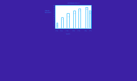
Free Powerpoint Bar Graph Templates

Create your presentation by reusing a template from our community or transition your PowerPoint deck into a visually compelling Prezi presentation.

bar graph

Transcript: don't use use don't use BAR GRAPHS!!!! hope you enjoyed :D The common errors associated with a Bar Graph It's really easy to understand a bar graph. All you need is a talley, x and y axis, labeling and BARS!! There are two types of bar graphs it shouldn't be confusing because we all know that a regular bar graph is just one bar and it's total. The other bar graph is called a double bar graph it's different because you have double the bar. We will show an example for each bar graph! :D What is a Bar Graph? When this graph should not be used How and Why we use A Bar Graph A bar graph should not be used when doing fractions, percentage or anything not related to comparing. We say this because Bar Graphs are only made for comparing results. It is also not good for continuous data detail for example..temperature is a continuous data so it would not be good for a bar graph. How to understand A Bar Graph :D What are the main Parts of a Bar Graph? Well we all know that all bar graphs have bars. Because if they didn't it wouldn't be named bar graph. The main part of the bar graph is the bars and the graph. People might get confused with a Bar Graph because some people think that when you use age you use a bar graph but you actually use a scatter plot or they could use a line graph as well. Another thing that people might get confused is the x and y axis and where the labeling goes on the x and y axis. It doesn't matter where the bars or labeling goes on the bar graph(x and y axis). By: Joseph & Nicole That's Our Explanation Of We use a bar graph to compare more than 2 activities, Food, Pets etc. We use a bar graph because it is easy to make and a good way to compare things easily. How we use a bar graph is easy because all you need is a graph with an x and y axis. For Example if you were to make a bar graph about sports like hockey, soccer, football, baseball and basketball you need to put the sports on the x axis and the numbers on the y axis or you can do it the other way around which ever is best for you.

Bar Graph

Transcript: https://people.richland.edu/james/lecture/m170/ch02-def.html Example Problem # 1 http://www.jpowered.com/graphs-and-charts/bar-chart-history.htm Horizontal Bar Graph Sources : Bar Graph Grouped Bar Graph Where can we use a bar graph? The organization of raw data in table form with classes and frequencies It is a really good way to show relative sizes: it is easy to see which types of movie are most liked, and which are least liked, at a glance. You can use bar graphs to show the relative sizes of many things, such as what type of car people have, how many customers a shop has on different days and so on. What is a Bar Graph? Many sources credit William Playfair (circa 1780) with inventing the bar chart, however a Frenchman, Nicole Oresme used a bar chart in a 14th century publication, "The Latitude of Forms", to plot velocity of a constantly accelerating object against time. Today bar charts and graphs are used everywhere and there are many forms and variations, but where invented them and where did they come from? A Bar Graph (also called Bar Chart) is a graphical display of data using bars of different heights. Bar graphs can be shown with the dependent variable on the horizontal scale Types of Bar Graph a way of showing information about different sub-groups of the main categories. Pat and Nadine have been thinking about what to do during the Christmas Break Sample Data http://www.ncsu.edu/labwrite/res/gh/gh-bargraph.html Statistics : Frequency Distribution table History

Now you can make any subject more engaging and memorable