You're about to create your best presentation ever

Design Presentation Boards Templates

Create your presentation by reusing one of our great community templates.

Templates Presentation

Transcript: 1- The user creates a New Space 2- During some time it's modified according to the project needs 3- As the space results useful for a whole company or area the user decides to ask for saving it as Template 4-The Collaborate Team takes care of this process 5- The new process covers the Analysis of the Space that we should save as Template and the Estimation to finish it. 6- Also we should contemplate the current release dates to provide the user the go live Date Save Templates with Content Some Issues are: New Process: 1- URLs that are inherited Some items to take in care to know in which Release the Template will go live: Templates Creation Process Columns Duplicated that couldn't be removed Current Process: Advantages and Disadvantages Features that couldn't be enable Content Type Duplicated that couldn't be removed 1- The user creates a New Space 2- During some time it's modified according to the project needs 3- As the space results useful for a whole company or area the user decides to ask for saving it as Template 4-The Collaborate Team takes care of this process, but during it we usually face some issues Duplicated Content Type This Process will be easier if... - The Site Collections are aligned - The user doesn't modify the Template meanwhile the support team is working on it - If the changes are planed with time Missing Features Issues Estimation: Duplicated Columns Hidden Features 1-The complex of the data inside the Space and its estimation. 2-The issues that we found testing it and the estimation related to them . 3- We will accept simple changes until 7 days before the first INT deploy. 4- Once we passed the limit to request changes the Template will go live in the Next Release. 5- If the user request new Changes after the first INT deploy they will be performed to the next release. .Dotx files required - Old Library Template

Creating Design Presentation Boards

Transcript: Use Typography as a Tool "Transparency can serve to emphasize values of directness and clarity through adjustments and juxtapositions that maintain the wholeness or legibility of elements. Transparency also can serve to built complexity by allowing layers to mix and merge together and can be used thematically to combine or contrast ideas, linking levels of context." http://www.gdbasics.com/html/transparency/transparency.html "Layers allow the designer to treat the image as a collection of assets, a database o possibilities" Layers allow you to create depth in a presentation, show subliminal messages or imagery and enhances the complexity of your project. http://www.gdbasics.com/html/layers/layers.html Hierarchy Why is this critical? Design Boards are the primary method of sharing information and ideas. Your client see's the design board, not necessarily the hours and hours of work you have done behind the scenes. Lydia Smolin ART 3340 - MWF 10:00-11:50 Creating Design Presentation Boards The Good,the Bad and the Ugly What do we like? Dislike? What is successful and where could there be improvement? Layers Less is More vs. Less is a Bore Text is a Tool, but one that should be used tactically. While your body of text in your presentation board needs to "speak" for you.... Say the most with the least "The order of importance within a social group or in a body of text" Hierarchy may be expressed through naming systems or conveyed visually through variations in scale, value, color, spacing, placement, etc. Regardless of approach, hierarchy employs clear marks of separation to signal a change from one level to another. http://www.gdbasics.com/html/hierarchy/hierarchy.html Transparency

Design Communication Through Presentation Boards

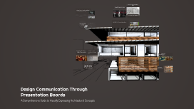
Transcript: Successful vs. Less Effective Presentation Boards Successful Presentation Boards Renowned architects, such as Zaha Hadid and Frank Lloyd Wright, utilize presentation boards that effectively communicate their vision through clear layout, strong visuals, and concise text. Their boards often highlight key concepts and showcase their design philosophies, making a significant impact on viewers. Workshop: Creating Your Own Presentation Board A structured approach to designing effective and visually appealing presentation boards. Digital Compilation Brainstorming Ideas Final Review and Feedback Designing Visual Elements Use software tools to compile and refine the presentation board. Less Effective Presentation Boards Sketching Layout Critique peers' boards and incorporate constructive feedback for improvement. Identify key concepts and themes to communicate effectively. Select colors, typography, and imagery to enhance the board's message. Create rough sketches to organize elements for clarity and impact. In contrast, less effective presentation boards may suffer from cluttered layouts, excessive text, and poor image quality. These boards fail to engage the audience and convey the intended message, often leaving viewers confused about the design intent. Visual Hierarchy Color Theory Typography Imagery Visual hierarchy is crucial in presentation boards as it guides the viewer's eye toward the most important elements. A well-structured layout organizes information logically, making it easier for the audience to comprehend the message being conveyed. Color theory plays a significant role in presentation boards by influencing how information is perceived. Different colors evoke various emotions and responses, and understanding color relationships helps create a visually appealing and effective design. Typography is essential for ensuring clarity in presentation boards. The choice of fonts affects readability and the overall aesthetic, so it is important to select typefaces that enhance the viewer's understanding without detracting from the visual appeal. Imagery, including graphics and photographs, is pivotal in reinforcing the message of a presentation board. High-quality visuals can captivate the audience's attention and provide context, making the design more engaging and memorable. Historical Evolution of Presentation Boards in Architecture Overloading with information Key Elements of Effective Presentation Boards A chronological exploration of how presentation boards have transformed over the years, reflecting advancements in technology and design practices. Common Mistakes to Avoid Poor image quality 1920s 1960s 1990s 2020s Advent of computer-aided design (CAD) software, leading to digital presentations that enhanced precision and creativity. Introduction of hand-drawn presentation boards that combined sketches and drawings to communicate architectural concepts visually. Shift to the use of physical materials like foam board and acetate overlays, allowing for more dynamic presentations. Current trends focus on interactive and multimedia presentations, integrating 3D models and virtual reality. Inconsistent design elements Engaging Discussion on Design Communication This session invites students to share their insights, experiences, and questions regarding the significance of presentation boards in architectural design. It encourages a collaborative environment where students can learn from one another and deepen their understanding of visual communication. Understanding Presentation Boards in Architecture Presentation boards are visual tools used in architectural design to communicate ideas, concepts, and design intentions effectively. They serve as a critical link between the architect's vision and the audience's understanding, enhancing the appreciation of the design process. "Good design is about making other designers feel like idiots because that idea wasn’t theirs." The Essentials of Design Communication in Architecture Insights on Design and Communication Design communication is crucial for architects as it allows them to convey complex ideas and concepts clearly and effectively. Presentation boards act as a visual language, bridging the gap between architectural vision and audience understanding. Design Communication Through Presentation Boards A Comprehensive Guide to Visually Expressing Architectural Concepts

Editing Presentation Templates

Transcript: Assets Editing Presentation Templates Optimizing Tools for Effective Customization Comment Overview of Available Templates Types of Templates A wide variety of templates are available, including those for business presentations, educational content, and marketing materials. Each type serves different purposes and audiences, facilitating tailored communication. Benefits of Template Editing Tools for Editing Templates Tools for Template Editing Editing templates can save time and effort while maintaining a consistent look across presentations. It allows for quicker updates and modifications, leading to increased efficiency and accuracy in information presented. Numerous editing tools exist, ranging from PowerPoint and Google Slides to specialized design software like Canva. These tools offer features that streamline the editing process while enhancing creativity. Templates vary widely but each type serves specific purposes and audiences. Understanding the different types can enhance your ability to effectively customize presentations, reports, graphics, and more. Infographic Templates Importance of Customization Effective template editing requires a diverse set of tools that cater to various needs, including software applications, online platforms, mobile solutions, and collaboration technologies. Identifying the right tools enhances creativity and streamlines the editing process, ultimately leading to more impactful presentations. Infographic templates enable the condensation of complex information into visually appealing formats. They support storytelling through data visualization, making information easily digestible for diverse audiences. Introduction to Editing Templates Software Options Customization allows users to tailor templates to their unique needs, enhancing visual appeal and effectiveness. A personalized template can significantly improve audience engagement and communication clarity, making your presentations stand out. Popular software options for template editing include Adobe Creative Suite for professionals needing advanced design capabilities, and Microsoft PowerPoint for simple presentations. Each software offers unique features that cater to different user requirements, from comprehensive editing tools to user-friendly interfaces. Editing templates is crucial for personalizing presentations and ensuring professional quality. This section highlights the significance of customization and the various tools available for effective template editing. Common Challenges in Editing Editing templates may present challenges such as maintaining consistency and ensuring design quality. Users often struggle with software limitations and finding the right elements to meet their needs. Marketing Templates Presentation Templates Online Platforms Plugins and Extensions Online platforms like Canva and Google Slides provide user-friendly interfaces for editing templates collaboratively. They offer various templates and customization options, making them suitable for users who prefer quick and easy access to design tools via the cloud. Plugins and extensions for software like PowerPoint enhance editing capabilities with additional features. Tools such as SlideModel or Office Timeline provide specialized templates and design elements, enriching the editing experience and saving time. Marketing templates provide structured formats for campaigns, ads, and branding strategies. Utilizing these templates can maximize outreach efforts and maintain brand consistency across channels. Presentation templates provide a structured layout for slideshows, enabling clear communication of ideas. They often come in various themes, enhancing visual appeal and engagement during presentations. Mobile Editing Applications Collaboration Tools Mobile editing applications such as Adobe Spark and Canva for Mobile allow for on-the-go editing of templates. These apps offer a range of design tools optimized for touch interfaces, helping users maintain productivity outside of traditional workspaces. Tools such as Slack and Trello provide collaboration features for teams working on template editing projects. These platforms facilitate communication and project management, ensuring that feedback and revisions are seamlessly integrated. Graphic Design Templates Report Templates Graphic design templates facilitate the creation of visual content across various media. They include layouts for social media posts, flyers, and brochures, enhancing brand visibility and message clarity. Report templates streamline the creation of professional documents, ensuring consistency in format and style. They often include predefined sections, making data compilation and presentation more efficient. Choosing the Right Template Conclusion and Q&A Animation and Transitions Advanced Graphic Integration Best Practices in Template Editing Selecting the appropriate template is foundational for effective communication. Align the template's design with the

Understanding Presentation Templates

Transcript: Photos Reusable assets Understanding Presentation Templates Ante molestie mattis arcu gravida viverra adipiscing volutpat. Ultrices eget viverra eu lectus ullamcorper. Consequat dictum tristique lectus augue felis nascetur amet non. Velit sit placerat tincidunt integer amet massa justo risus netus. Ornare sagittis malesuada varius cursus ipsum erat libero metus eget. Colors Assets A Comprehensive Guide to Creating Effective Presentations 04 01 02 03 Title Aa Aa Subtitle S M W T T S F Paragraph Aa Aa Definition of Presentation Templates Personalizing Templates Practice and Delivery Techniques Practicing presentation delivery enhances confidence and clarity. Techniques include rehearsing in front of peers, utilizing feedback, adjusting pacing, and mastering body language to create a stronger connection with the audience. Templates can be personalized through color schemes, styles, and layout adjustments to reflect the presenter's personality or specific audience requirements. This customization fosters a unique connection and enhances engagement during the presentation. Presentation templates are pre-designed layouts that provide a visual structure for creating slides. They often include placeholders for text, images, and multimedia elements, allowing users to easily develop a cohesive presentation. Consistency in Design Visual Hierarchy Gathering Feedback and Improving Storytelling in Presentations Visual hierarchy directs audience attention to essential information. Utilizing size, color contrast, and placement establishes a priority for viewers, making it easier to process and understand content. A well-featured design aligns focus with intent, ensuring key messages stand out. Consistency across slides fosters a professional and cohesive look. Utilizing uniform fonts, colors, and layouts makes presentations easier to follow and reinforces brand identity. Achieving a unified style boosts credibility and keeps the audience focused on the content rather than design differences. Adding Multimedia Elements Incorporating storytelling transforms presentations into memorable experiences. Structuring content as a narrative fosters emotional connection, enhances relatability, and aids in conveying complex information by putting it into context. Types of Presentation Templates Feedback is crucial for continuous improvement. Collecting audience and peer insights post-presentation provides valuable perspectives that can be used to refine delivery, content clarity, and overall impact for future engagements. Importance of Templates in Presentations Customization Techniques Introduction to Presentation Templates Templates play a crucial role in streamlining the presentation creation process. They enable presenters to maintain brand consistency, save time during design, and focus on content delivery rather than formatting. There are several types of presentation templates including corporate, educational, and creative templates. Each category caters to different audiences and purposes, with unique design elements tailored to enhance engagement. Incorporating multimedia elements such as videos, audio clips, and animations can significantly boost engagement and retention. For instance, a short video can illustrate complex concepts, making them more accessible to the audience. Font Selection and Typography Customizing presentation templates enhances relevance and engagement, tailoring designs to the audience's preferences and the subject matter. Effective customization transforms generic slides into impactful narratives that resonate with viewers. Presentation templates serve as structured frameworks that enhance the efficiency of creating effective presentations. They provide consistency in design, guide the narrative flow, and ensure that key messages are communicated effectively. Effective Use of Visuals Layout and Structure Visuals enhance audience engagement and information retention. Utilize images, charts, and graphs strategically to complement spoken content and clarify complex ideas, ensuring they are relevant and high-quality to maintain professionalism. Font choice affects readability and audience impression. A combination of serif fonts for headings and sans-serif for body text often yields the best results. Consistent typography not only aids in visual coherence but also enhances information retention. An effective layout organizes content clearly and logically. Employing grids, white space, and alignment guides the viewer's eye, enhances focus, and promotes information flow. Structured layouts help in maintaining audience engagement throughout the presentation. Common Elements of Templates Overall Impact of Templates Accessibility Considerations Incorporating Brand Identity Adapting templates to include brand colors, logos, and fonts reinforces brand recognition. Consistent branding across all materials strengthens the connection between the audience and the company, enhancing trust and credibility. Most

Design Jury Templates

Transcript: Introduction to Jury Templates Key Principles of Effective Design Purpose of Jury Templates Effective jury templates should prioritize clarity, simplicity, and usability. By adhering to these principles, templates enhance the user experience for judges, making evaluations more streamlined and efficient. The primary purpose of jury templates is to organize information effectively and facilitate the assessment of design projects. They provide a standardized approach to evaluating submissions, ensuring every project is judged against the same criteria. Target Audience for Templates Importance in Design Evaluations The primary audience for jury templates includes design educators, industry professionals, and students participating in design competitions. Understanding their needs ensures templates are tailored to enhance the evaluation experience for all stakeholders. Jury templates play a crucial role in design evaluations by promoting consistency among multiple judges. This consistency helps minimize biases and ensures that each design is examined objectively, leading to more fair outcomes. Image Search Keywords Combined Overview of Template Components Key components of jury templates typically include evaluation criteria, scoring systems, and space for judges' comments. These elements ensure comprehensive feedback while keeping evaluations structured and transparent. Jury templates, design evaluation, assessment tools Design Jury Templates Implementation and Feedback Methods of Template Distribution Case Studies of Successful Templates Templates can be distributed through design platforms, email newsletters, or integrated within design software used by professionals. Leveraging digital access enhances user engagement and facilitates ease of use across various design teams. Analyzing successful jury templates, such as those used in architectural critiques, reveals key design elements that enhance their effectiveness. Successful cases often showcase clarity, ease of navigation, and engagement. Gathering Feedback from Users Feedback mechanisms should include surveys, direct interviews, and user testing sessions. Utilizing tools like Google Forms or Typeform can streamline the feedback process, allowing for quantitative and qualitative insights. Best Practices for Future Developments Best practices include prioritizing user-centric design, ensuring usability across platforms, and regularly updating the templates based on industry trends. Engaging users in the creation process also leads to higher adoption rates. Iterating on Template Designs Post-launch, templates should undergo regular reviews based on user feedback. Iteration involves adapting styles, layouts, and functionalities to meet evolving design needs and preferences. Creating Effective Presentation Tools for Design Evaluations Design Elements of Jury Templates Color Schemes and Typography Visual Hierarchy Layout and Structure An intuitive layout ensures that judges can quickly assess submissions. Use grids and clear sections to enhance readability and focus on key information without distraction. A well-defined visual hierarchy directs the audience's attention and highlights critical elements effectively. Use font sizes, colors, and spacing to prioritize information and guide users through the content. Consistent color schemes enhance brand identity while maintaining professionalism. Choose fonts that are readable and size-appropriate for all potential users in the template. Imagery and Icons Usage Accessibility Considerations Strategic use of images and icons can convey complex ideas quickly, aiding in design communication. Icons should be universally recognizable to ensure clear understanding by diverse audiences. Designing jury templates with accessibility in mind ensures inclusivity. Consider color contrast, font size, and alt text for images to accommodate all users, including those with disabilities.

Now you can make any subject more engaging and memorable