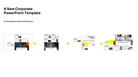
A New Corporate PowerPoint Template
Transcript: Photos Reusable assets A New Corporate PowerPoint Template Ante molestie mattis arcu gravida viverra adipiscing volutpat. Ultrices eget viverra eu lectus ullamcorper. Consequat dictum tristique lectus augue felis nascetur amet non. Velit sit placerat tincidunt integer amet massa justo risus netus. Ornare sagittis malesuada varius cursus ipsum erat libero metus eget. Colors Assets Developing Brand-Aligned Slide Designs 04 01 02 03 Title Aa Aa Subtitle S M W T T S F Paragraph Aa Aa Embedding Techniques Consistency Across Slides Importance of Branding Ensure the logo appears on every slide in the same manner to reinforce brand identity. Consistency in color, size, and position not only enhances professionalism but also aids audience recall. Use embedding techniques that ensure the logo remains intact across different devices and formats. Save the logo in high-quality formats such as PNG for transparent backgrounds, or SVG for scalability without loss of quality. Branding plays a crucial role in how an organization is perceived. Consistent use of visual elements, like the company logo and theme colors, fosters recognition and trust among clients and stakeholders. Slide Design Options Purpose of the Template Title Slide Design Logo Placement Guidelines Overview of Design Elements Visual Impact of the Logo This section covers essential elements for creating engaging slide designs that adhere to corporate branding. Each component plays a pivotal role in maintaining visual consistency and enhancing audience engagement. The primary purpose of the PowerPoint template is to standardize presentations across the company. By establishing a uniform design, each presentation contributes to a cohesive company image that aligns with our core values and mission. Position the logo in the top left corner of each slide for immediate visibility. Maintain sufficient padding around it to avoid visual clutter, ensuring it stands out while complementing the overall design. The title slide sets the tone for the presentation. Incorporate the corporate logo prominently for brand recognition, and use bold, legible fonts. Essential elements include the presentation title, subtitle, and date, ensuring clarity and professionalism without cluttering the slide. The logo acts as a visual anchor in presentations, enhancing brand awareness. A well-placed logo increases viewer trust and recognition, contributing to an effective communication strategy. The template integrates essential design elements such as a clear color palette, consistent typography, and appropriate use of imagery. Each element works in harmony to enhance readability and visual appeal, reinforcing brand identity. Examples of Best Practices Implementation and Feedback Utilizing Theme Colors Best practices include utilizing consistent fonts, aligning images and text uniformly, and adhering to brand colors. These practices not only enhance visual quality but also reinforce brand identity in presentations. Goals for Future Work Implementing a new corporate PowerPoint template requires strategic planning and open communication. Gathering team feedback is crucial for continuous improvement and ensuring that the template meets the needs of all users. Content Slide Variations Theme colors should reflect the brand’s identity. Use the primary colors such as red, blue, orange, green, and yellow consistently throughout the slides, ensuring that critical information stands out, especially in titles and headings. The aim is to continuously refine the PowerPoint template to meet evolving corporate needs. By incorporating feedback and including innovative design practices, the template will remain relevant and effective for all future presentations. Content slides should vary in layout to maintain audience interest. Utilize templates that allow for bullet points, graphics, or video inserts. Consistency in font, color, and logo placement across all content slides enhances the overall cohesive look. Rollout Strategy Continuous Improvement Collecting Team Feedback Image and Text Alignment The rollout strategy involves a phased implementation where team leads receive training first. This ensures that they can assist their teams effectively, maximizing the template's potential across the organization. Logo Integration Introduction to the Template Establishing feedback channels through surveys and meetings allows team members to share their experiences using the template. This direct input can guide future iterations and adjustments to enhance usability. Continuous improvement is key; analyze collected feedback and implement necessary changes to the template. Regular updates help maintain relevance and ensure the template evolves with the organization’s needs. Correct alignment between images and text is vital for readability and aesthetic appeal. Images should complement the text and not overwhelm it; maintaining balance helps convey the message effectively without distractions. This section