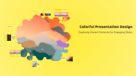
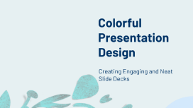
Colorful Presentation Design
Transcript: Red: Passion and Energy Red is often associated with strong emotions such as passion and love, making it a powerful choice for drawing attention and creating urgency. It can stimulate energy, making it ideal for designs that aim to inspire action. Cool Color Palette Warm Color Palette Blue: Trust and Calmness Blue is frequently linked to feelings of tranquility and reliability. It is a popular choice for corporate and healthcare designs, as it instills a sense of trust and professionalism, promoting calmness in viewers. In contrast, a cool color palette, which includes blues, greens, and purples, tends to convey professionalism and calmness. It is frequently used in corporate presentations or designs aimed at instilling trust and reliability. A warm color palette, featuring reds, oranges, and yellows, can evoke feelings of warmth and excitement, making it ideal for friendly, informal settings. It is often used in designs aimed at creating a sense of community or approachability. Yellow: Happiness and Attention Impact of Colors on Perception Yellow is often associated with happiness and optimism. It can grab attention quickly and is effective for highlighting important information, but it should be used sparingly to avoid overwhelming viewers. Green: Growth and Harmony Green symbolizes growth, harmony, and nature. It is commonly used in environmental and wellness designs, conveying a sense of balance and freshness that resonates well with audiences. Purple: Creativity and Luxury Purple is linked to creativity and luxury. It can evoke feelings of sophistication and mystery, making it ideal for artistic and high-end branding, creating an aura of exclusivity. Use Complementary Colors Utilizing complementary colors helps create visual interest and draws attention to key elements in a design. This technique is particularly effective in presentations where engagement is essential. Prioritize High Contrast Effective Color Combinations and Contrast Colors with high contrast improve legibility, especially for text-heavy slides. Ensure that there is a significant difference between the background and font colors to enhance readability. The Impact of Colorful Designs Try Analogous Schemes Colorful designs are essential for attracting attention and effectively communicating messages. They have the power to evoke specific emotions, create memorable experiences, and establish the desired tone for presentations, making them a vital tool in design. Experimenting with analogous color schemes can create harmony in a presentation. This approach uses colors that are next to each other on the color wheel for a cohesive look without overwhelming the viewer. Evolution of Colorful Designs A timeline illustrating significant milestones in the use of color across design movements. 1970s 2000s Early 20th Century Psychedelic art created vibrant, swirling patterns and colors, impacting poster designs and music album covers during this era. The rise of digital design tools allowed for creative freedom in color selection, leading to diverse and innovative designs in web and graphic design. The Fauvism movement emerged, emphasizing bold colors and emotional expression in art, setting the stage for modern color usage in design. 1950s Present Day The introduction of Pop Art featured bright colors and commercial imagery, reflecting consumer culture and influencing graphic design. Contemporary design embraces color theory, with a focus on inclusivity and accessibility, utilizing bold and harmonious palettes. Colorful Presentation Design Empower Your Presentations with Color Tools Utilizing tools such as Canva and Adobe Color allows users to easily select and apply vibrant color palettes, enhancing the visual appeal of their presentations. These platforms offer user-friendly interfaces and various features to streamline the design process, making it accessible for everyone. Exploring Vibrant Elements for Engaging Slides Enhancing Communication Best Practices in Color Usage Effectively utilizing color in design significantly enhances communication and audience engagement. By understanding the psychological impact of colors, designers can create visuals that resonate with viewers and convey intended messages more powerfully. Adhering to best practices in color usage is essential for clarity and impact. These include selecting appropriate color palettes based on context, ensuring adequate contrast between text and backgrounds, and regularly testing designs for accessibility across diverse audiences.