You're about to create your best presentation ever

Color Palette Powerpoint Template

Create your presentation by reusing a template from our community or transition your PowerPoint deck into a visually compelling Prezi presentation.

Color Palette Presentation

Transcript: Color Palette Presentation Exploring the Dynamics of Color #001129, #005288, #FFC107 Introduction to Color Theory Color Codes Importance of Color in Design Hex Code #005288: Ocean Blue Hex Code #001129: Deep Blue Color is a fundamental element in design, impacting aesthetics and functionality. It influences user experience, attracts attention, and communicates brand identity, making it crucial for effective communication in any design project. Primary, Secondary, Tertiary Colors Hex code #005288 is an ocean blue shade, evoking feelings of calmness and vitality. This color is often utilized in designs related to water, nature, and outdoor themes. Hex code #001129 represents a deep blue color, often associated with depth and stability. It is frequently used in corporate branding to convey trust and reliability. Colors are categorized into primary (red, blue, yellow), secondary (green, orange, purple), and tertiary. Understanding these categories is essential for creating effective color mixes and combinations in design projects. Psychological Effects of Colors Color Harmony Principles Colors have psychological implications, often evoking specific emotions. For instance, blue conveys trust and calmness, while red is associated with urgency and excitement, impacting consumer behavior and decision-making processes. Color Representations in Digital Media Hex Code #FFC107: Amber Yellow Color harmony involves combining colors in a way that is pleasing to the eye. Techniques such as complementary, analogous, and triadic color schemes enhance the overall aesthetics of designs, guiding viewer perception. Hex code #FFC107 denotes an amber yellow hue associated with sunshine and warmth. It is frequently applied in promotional materials to attract attention and create a sense of cheerfulness. In digital media, colors are represented using hex codes, which allow for precise reproduction across various platforms. These codes ensure consistency in color usage in web design and graphic materials. Color Wheel Overview The color wheel serves as a visual representation of colors, defined by relationships between hues. It helps designers understand color combinations, aiding in the creation of appealing and coherent palettes. Application of Hex Codes in Design Font Typography Hex codes are integral in ensuring color accuracy in digital design projects. Designers use these codes to maintain brand consistency across different media, including websites, apps, and print. Importance of Font in Visual Communication Fonts convey personality and tone. They can influence emotions and perceptions while enhancing message clarity, making thoughtful font selection vital for effective communication. Pairing Fonts with Color Schemes Effective font pairing enhances visual aesthetics. Combining League Spartan with a vibrant color like #FFC107 creates contrast, while Montserrat can soften layouts when paired with neutral tones like #001129. Overview of League Spartan League Spartan is a strong, geometric sans-serif font inspired by classic type foundries. Its bold aesthetics make it suitable for headlines and websites, offering modern appeal without sacrificing readability. Designing for Readability Readability is essential in typography; font choice should prioritize legibility and accessibility. Choosing the right size, spacing, and line height improves text comprehension and overall user experience. Characteristics of Montserrat Montserrat is a popular sans-serif typeface characterized by its versatility and contemporary style. Its rounded edges and varying weights make it suitable for headings and body texts, ensuring visual harmony. Practical Applications Visual Identity in Branding Marketing and Advertising Strategies Branding relies heavily on color psychology to convey emotions and values. For instance, blue can evoke trust and dependability, while yellow represents optimism and warmth, demonstrating why companies carefully select specific hex codes. Effective marketing campaigns leverage color to capture attention and create emotional connections. The use of contrasting colors, like #FFC107 against a dark background, improves visibility and brand recall in advertising materials. Color Theory in Art and Illustration User Interface Design Considerations Artists and illustrators apply color theory principles intentionally to evoke specific emotions or moods. Understanding complementary colors and contrasts can lead to visually striking artwork that captivates audiences. In UI design, color choices must enhance usability while ensuring aesthetic appeal. Combining #001129 for backgrounds with Montserrat font enables readable interfaces that guide user navigation effectively. Case Studies of Successful Color Use Brands like Instagram effectively use a gradient of colors to evoke creativity and youthfulness, demonstrating how strategic color palettes can significantly contribute to brand recognition and user engagement. Conclusion and Takeaways

Color Palette Exploration

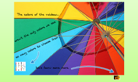
Transcript: Color Palette Exploration A Journey Through Vibrant Hues Red-Orange Red-Orange is a vibrant tertiary color blending the warmth of red with the brightness of orange. It evokes feelings of excitement and enthusiasm, making it effective in designs that aim to attract attention and convey energy. Yellow-Orange Yellow-Green Tertiary Colors Yellow-Green mixes the rejuvenating qualities of yellow with the calmness of green. This color represents growth and harmony and is often used in designs reflecting nature, health, and vitality. Yellow-Orange combines the cheerfulness of yellow and the warmth of orange, creating a lively and inviting hue. It's often associated with creativity and optimism, making it suitable for branding aimed at conveying positivity. Tertiary colors arise from mixing a primary color with a secondary color, creating complex hues that enhance the versatility of color palettes. They bring depth and variety to artistic and design projects, allowing for more expressive and dynamic compositions. Green (Blue + Yellow) Blue-Green Red-Purple Blue-Purple Green is the secondary color formed by mixing blue and yellow. It embodies freshness and vitality, often associated with nature, growth, and tranquility. This combination is widely used in design to invoke calmness and harmony. Blue-Purple combines the mystique of blue with the creativity of purple. This color often evokes feelings of luxury and sophistication, making it ideal for high-end branding and artistic endeavors. Blue-Green, also known as teal, is a sophisticated mix of blue and green. It strikes a balance between tranquility and vibrancy, making it a popular choice for brands seeking professionalism while appealing to a sense of calm. Red-Purple merges the passion of red with the creativity of purple, creating a hue that is both bold and imaginative. This color is frequently used in artistic contexts to evoke strong emotions and a sense of uniqueness. Mixing Primary Colors Orange (Red + Yellow) Orange emerges from combining red and yellow, reflecting enthusiasm and warmth. This vibrant secondary color is often used in marketing and design to capture attention and evoke excitement, embodying energy and creativity. Secondary colors result from the combination of primary colors. Mixing equal parts of any two primary colors produces a secondary color, extending the color wheel and enabling the creation of vast hues. Purple (Red + Blue) Purple is created by mixing red and blue, symbolizing luxury and creativity. Often seen in artistic expressions, purple can evoke feelings of mystery and spirituality, making it a popular choice among artists and designers. Understanding Secondary Colors Secondary colors arise from mixing equal parts of primary colors, enhancing the color spectrum and offering a broader palette for artists and designers. This section delves into the creation of secondary colors, highlighting their unique properties and combinations. Red Primary Colors Red symbolizes passion and energy, and it can evoke strong emotions. In design, red is often used to create a sense of urgency and attract attention, making it an effective choice in marketing and advertising. Primary colors serve as the foundation for all other colors in the spectrum. Understanding red, blue, and yellow is crucial for effective design and artistic expression. The Significance of Color in Design Yellow Complementary Colors Color is vital in design as it can establish brand identity, evoke emotions, and convey messages. Companies often use specific color schemes to attract customers and enhance user experience, ultimately impacting purchasing decisions. Color Combinations and Usage Color Temperature and Emotions Characteristics of Cool Colors Complementary colors are opposite each other on the color wheel, such as red and green. They create a high contrast, vibrant look when used together, making elements stand out in designs like branding and advertisements. Yellow is a bright, cheerful color that signifies optimism and creativity. Often used to grab attention, it can invoke feelings of happiness; however, excessive use can be overwhelming in design contexts. Understanding color combinations enhances design effectiveness. Complementary, analogous, and monochromatic schemes are fundamental strategies that help create visual harmony and impact. Cool colors, including blue, green, and purple, are linked to calmness, tranquility, and serenity. They are reminiscent of water, sky, and vegetation, promoting relaxation and contemplation. Cool colors often create a soothing atmosphere, ideal for spaces requiring peace and focus. Color temperature significantly impacts emotions and perceptions. Warm colors often incite feelings of passion and enthusiasm, while cool colors tend to encourage relaxation and introspection. Understanding these dynamics is essential for effective design strategies and emotional engagement. What is Color? Blue Analogous Colors Practical Applications

Nature's Color Palette

Transcript: Nature's Color Palette Making Your Own Plant-Based Paint Required Materials To make plant-based paint, gather natural pigments from fruits, vegetables, and flowers, along with a binder like corn syrup or egg yolk. Other necessary materials include a mortar and pestle for grinding, water for mixing, and containers for storage, ensuring a smooth painting process. Applications and Benefits Step-by-Step Process Start by crushing chosen plant materials to extract pigments, then mix them with your binder and water until achieving a smooth consistency. Experiment with ratios to create different shades and store your paint in airtight containers to maintain freshness for future use. Eco-Friendly Art Supplies Plant-based paints are made from renewable resources and are biodegradable, reducing harmful environmental impacts compared to synthetic paints. Their use minimizes toxic waste, making them a sustainable choice for artists and consumers alike. Tips for Achieving Desired Colors Cultural Significance of Natural Dyes For vibrant colors, use fresh ingredients and avoid excessive water to maintain pigment intensity. Adjust your binder to alter the texture and opacity, and experiment with blending different plant sources for unique shades and effects. Natural dyes have been utilized across cultures for centuries, reflecting traditional practices and local biodiversity. Their applications in textiles and art reveal cultural heritage and foster community identity, emphasizing sustainability and conservation. Future Trends in Plant-Based Paints Creating Plant-Based Paints from Natural Ingredients The growing demand for sustainable products is driving innovation in plant-based paints, leading to advancements in colorfastness and durability. A focus on education and awareness is expected to enhance their adoption in both art and industry. Natural Pigments Common Plants for Pigmentation Many plants provide vibrant pigments. For instance, beetroot yields a rich red, turmeric is known for its bright yellow, and spinach contributes a lively green, showcasing nature’s diverse palette. Extraction Methods for Colors Color extraction techniques vary from simple boiling to advanced methods like cold pressing. Each method impacts the intensity and hue of the pigment, making the right choice critical for quality. Color Variations from Different Plants Colors derived from plants can vary greatly due to factors such as soil, climate, and plant maturity. For instance, the hue of a pigment can shift from yellow to orange based on these environmental conditions. Introduction to Plant-Based Paints Definition of Plant-Based Paints Importance of Natural Ingredients Overview of Color Sources in Nature Plant-based paints are made using natural ingredients derived from plants, such as fruits, vegetables, and flowers, which provide a range of colors and shades. These paints represent a sustainable option, reducing reliance on toxic synthetic materials that can harm the environment. Utilizing natural ingredients in paints is crucial for environmental health and human safety. Synthetic pigments can release harmful chemicals, while plant-based alternatives are biodegradable and non-toxic, promoting a safer ecosystem and reducing pollution. Nature provides an abundant source of colors, including chlorophyll for green, carotenoids for yellow and orange, and anthocyanins for blue and purple hues. Different parts of plants, such as leaves, roots, and flowers, contribute unique colors, enabling a diverse palette for artistic creation.

Now you can make any subject more engaging and memorable