You're about to create your best presentation ever

Box And Whisker Plot Powerpoint Template

Create your presentation by reusing a template from our community or transition your PowerPoint deck into a visually compelling Prezi presentation.

Box and Whisker Plot

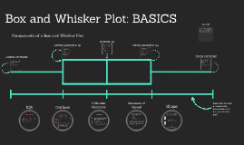
Transcript: 0 1 2 3 4 5 6 12 Min-0 Q1-5 Mid-10 Q3-45 Max-120 While doing this experiment, we found that the average Accelerated class takes one hour to do homework. The regular History class homework on average takes ten minutes. This has proved that the Accelerated class takes longer to complete homework. History Data- Min-30 Q1-45 Mid-60 Q3-110 Max-120 Accelerated- 40, 30, 60, 100, 120, 100, 120, 40, 50, 60, 120, 50 History- 20, 30, 10, 5, 10, 10, 5, 0, 10, 40, 50, 55, 60, 120, 10, 10, 5, 45, 0 0 00 00 00 00 000 00555 000000 0 0 05 05 0 0 How long it takes someone in regular History to do their homework vs. Accelerated. Why? 3 4 5 6 10 12 Reflections Box and Whisker Plot Paige Shema and Julia Cody More... We heard the the Accelerated History is much harder than the regular class. We wanted to find out if this is true by collecting data and figuring out if Regular History really does assign less homework than the Accelerated class. Scenario- Accelerated Stem and Leaf Plot We believe that in general it takes Accelerated classes longer to complete work because of the level of dificulty of the homework. We believe we got this result because the accelerated class is at a higher level of dificulty than the average class we must take. Another factor is that people in the accelerated class have to be tested into the class so they know they can understand the basics. The regular history class is a requirement, so people in that class might not be as motivated to do their homework. This data tells us that the accelerated class is harder and more intense with work. If you don’t have a good work ethic or don’t like history it might not be a good idea to take this class but if you want to get into higher history classes in the future or really like history and you're willing to put in the effort then this might be the class for you. Although, if we had different participants, the average will possibly be different as well as the Q1, Q3, Maximum and Minimum. If you were to use different classes, different teachers, or even grades, there could very well be a different box plot.

BOX AND WHISKER PLOT

Transcript: In order to make a box plot you need a minimum and maximum. The minimum is the smallest number, and it is the first number. The maximum is the largest number, and it is the last number on the plot. YEE I guess I'll teach you how to make a box and whisker plot. -Maria Davila P2 OK Kid, Now time to start the real action. Put them numbers in order YOU'RE ALMOST DONE Hey You're Getting Somewhere Since you have your median, its time to find the first and third quartiles. The first quartile is the first half before the median, and the third quartile is the the last half after the median. The first quartile will mark the fist part of the overall area where the students scored, and the third quartile will mark the ending. Min & Max YO 5 Values BOX AND WHISKER PLOT Before you start, you have to put the numbers in order from least to greatest. Don't ask me why... just do it. Don't want to do it? You little rebel, you. If you don't do as I say I'm going to be really disappointed in you. Since Fountain really wants to see how his did over all, he pick 10 different test scores from 10 different students. 28, 100, 78, 71, 99, 55, 82, 74, 86, 75 Now put those in order! 28, 55, 71, 74, 75, 78, 82, 86, 99, 100 You finally did something right! Now you have all of the 5 values. Right? If you don't... well find them. The first thing you do is draw a line, put the min in the begining, the max as the last. You put the Q1 & Q3 on the line and make a box connecting the two numbers. The median you make a line and darken it WHY So it can be easier to find all of the fancy stuff to make a box plot thing you can find the median first. The median if the number in the middle. Sometimes you have an even amount of numbers, so you have to get the exact middle. Fountain had to choose 10 score, no not 5, but 10. Why do we learn how to do box and whisker plot, you ask? I don't know, ask somebody else. OK, I heard Fountain says that box and whisker plots are useful. Apparently, many schools and teachers use box and whisker plots to find out the results of test. For example Fountain want to see how amazing his class did on the box and whisker plot test. To see the overall class results, he will find the 5 values. Now Fountain has finished making the box and whisker plot. Is he happy with the scores? Eh. Is he mad? Eh. Will he assign more work to impore the scores? I don't know

Box and Whisker Plot

Transcript: Components of a Box and Whisker Plot: LOWER EXTREME LOWER QUARTILE: Q1 MEDIAN: Q2 UPPER QUARTILE: Q3 UPPER EXTREME NOTES IQR Outliers 5 Number Summary Measures of Spread Shape This is the highest value in your set of data, excluding outliers lopsided If the longer part of the box is to the right (or above) the median, the data is said to be skewed right. If the longer part is to the left (or below) the median, the data is skewed left For example, in a data set composed of 1 3 4 4 5 7 7 9 we know the median is at 4.5, therefore, the first half of data is: 1 3 4 4 So the Q1 would be... (3+4)/2 = 3.5 This is basically the median of the first half of your data Min - smallest value in data set (aka lower extreme) Q1 - refer to slide Median - middle value Max - largest value in a data set (aka upper extreme) For example, in a data set composed of 1 3 4 4 5 7 7 9 we know the median is at 4.5, therefore, the second half of data is: 5 7 7 9 So the Q1 would be... (7+7)/2 = 7 consists of... 2 kinds of shapes: symmetric & skewed essentially, it is the width of the "box" to find it, simply solve: Q3 - Q1 to determine if a value is an outlier solve this formula: Q1 – 1.5×IQR or Q3 + 1.5×IQR those are your parameters, any numbers exceeding this range is considered to be an outlier This is the middle value of your data 1 for example, in a data set composed of 1 3 4 4 5 7 7 9 the higher extreme would be 9 because it is the highest value This is basically the median of the second half of your data or "interquartile range" for example, in a data set composed of 1 3 4 4 5 7 7 9 the lower extreme would be 1 because it is the lowest value This is the lowest value in your set of data, excluding outliers for example, in a data set composed of 1 3 4 4 5 7 7 9 our median would be... (4+5)/2 = 4.5 an observation that lies an abnormal distance from other values in a random sample from a population range quartiles interquartile range variance standard deviation describe how similar or varied the set of observed values are for a particular variable The data set given will not always be in numerical order, just remember to always put them in order from least to greatest before figuring out your measures Box and whisker plots can be compared on one number line Make sure to draw a number line underneath your box and whisker plot! 2 skewed: *Often times in statistics, you will be asked to distinguish outliers, explain them in context, and find possible reasons Box and Whisker Plot: BASICS So, when we are using a box and whisker plot to present data, or we are analyzing a box and whisker plot, we are looking at the way the set of data is spread - how similar or different the values are from each other symmetric: roughly the same on each side when cut down the middle

Now you can make any subject more engaging and memorable