You're about to create your best presentation ever

Artsy Magazine Powerpoint Template

Create your presentation by reusing a template from our community or transition your PowerPoint deck into a visually compelling Prezi presentation.

Artsy

Transcript: Changes in Art During and After WWI Traditional Western art ideas from before the war were turned around. People started to speak their emotional views through the pieces they created. “World War I reshaped the notion of what art is, just as it forever altered the perception of what war is” (Johnson). “In visual art, Surrealists and Expressionists devised wobbly, chopped-up perspectives and nightmarish visions of fractured human bodies and splintered societies slouching toward moral chaos” (Johnson). Dada, an art movement developed in Switzerland, created pieces of art that made people question society instead of pleasing artwork. Art changed from artistic styles to expressive styles. Broken Gun sculpture found in Belgium Self-Portrait by Max Beckmann is shown at the Paris' Pompidou center in France this painting shows a man expressing how he truly feels about the war war produced chaos making him feel hopeless for things to go back to normal "Maple leaf in sunder by razor blade" by Karl-Ludwig Poggemann Berlin, 2007 Disillusionment of the war /Razor The razor, originally used for good, is now being used to strip a living leaf in half . This is just as the war was thought to have been a good thing until people realized how bad it can actually be. The razor left the leaf unable to put itself back together just as the people were left hopeless after the war http://study.com/academy/lesson/reflections-of-war-in-early-20th-century-art.html Art in World War I Artsy WWI this gun, once thought of as a good thing having the advantage over the enemy, is now seen as a bad thing, killing many soldiers. they wanted piece ; no more war breaking the gun symbolizes the start of peace/ no more war Socio-cultural changes in art in the decade following World War I do reflect the concept of a Lost Generation.

powerpoint template

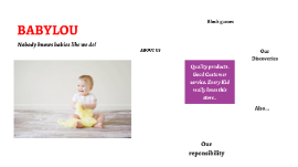
Transcript: Nobody knows babies like we do! Quality products . Good Customer service. Every Kid really loves this store.. BABYLOU ABOUT US About Us BabyLou was established in 2004. It has been more than a decade since we started, where we have ensured to take care of every need and want of every child and infant under one roof, true to the caption “NO BODY KNOWS BABIES LIKE WE DO”. Our benchmark is to provide 100% customer service and satisfaction and continue to deliver the same with a wide range of toys, garments and Baby Products. Play and Create We Are Best 01 02 03 Block games Building Blocks help Kids to use their brain. PLAY TO LEARN in Crusing Adventures Our Discoveries Enjoy a sunny vacation aboard a luxury yacht with the LEGO® Creator 3in1 31083 Cruising Adventures set. This ship has all the comforts you need, including a well-equipped cabin and a toilet. Sail away to a sunny bay and take the cool water scooter to the beach. Build a sandcastle, enjoy a picnic, go surfing or check out the cute sea creatures before you head back to the yacht for a spot of fishing. Escape into the mountains Disney Little Princes in Also available for your Babies..... Also... Out of The World… Our reponsibility BABYLOU…. Our Responsibility All children have the right to fun, creative and engaging play experiences. Play is essential because when children play, they learn. As a provider of play experiences, we must ensure that our behaviour and actions are responsible towards all children and towards our stakeholders, society and the environment. We are committed to continue earning the trust our stakeholders place in us, and we are always inspired by children to be the best we can be. Innovate for children We aim to inspire children through our unique playful learning experiences and to play an active role in making a global difference on product safety while being dedicated promoters of responsibility towards children.

ARTSY

Transcript: ALISHA AMINMOHAMED CANDIDATE NO 134 October 2020 MEDIA AS LEVELS CRITICAL REFLECTION ARTSY GENERAL INFORMATION ARSTSY MAGAZINE I made this aiming to give a new insight of art through a magazine. I got roused to do so on the grounds that there are very few acceptable art magazines out there and I feel as though it has tremendous potential considering art is obviously all over the place however it is underrepresented. Within Kenya, there not many creative or interesting art magazines. They are limited and that is why I decided to take, on the challenge of making one. Another thing that served as motivation is my personal experience as an artist. I know how it is to participate in a competition and some guy wins because he is well known not because of his work. Then the judge comes and talks to you and tells its the artists contacts. Aspiring artists really struggle to make a name even if the work is full of quality because of the society and they end up getting demotivated, heart broken and feeling like their work is not good enough. It gets worse for females. I likewise got persuaded by attempting to depict females in the art business through my double page spread as they are not put out there like men in art. The magazine is aimed to be for aspiring artists, people interested in seeing art and-experienced artists with the age range being old teens (16) to middle aged people (around 35) The genre of this magazine is art. It is meant to be both education in that it is teaching its audience new techniques of art and yet interesting as it has art related gossip These are links to my blog and flip-book https://alishamohammed.blogspot.com/ https://online.flippingbook.com/view/1027920/ COVER GENERAL For my front cover page, I tried to put a bold image so that it attracts potential buyers and an audience because of its contrasting colors and in your face drawing. I tried to use a unique font (Noto Serif Display ExtraConde) for the masthead and i put the price and company on the left coloumn. I made my coverlines black to make them pop more and I also put a bar code to follow more codes and convention of my magazine. I made the border bright red then black to drag more attention to the cover image and make the magazine stand out out of the norms. INSPIRATION I used this as inspiration because I liked the contrasting colors and the use of the border CONTENTS PG ABOUT I made this cover page and stuck to it because I felt as if one image would be plain. Instead, I decided to try to give variety to my magazine and I was also advised to do so. I put my topics in a chronological way and I also put titles with little lines of more information on the heading. I used 3 different images of different backgrounds. I used a picture from the interview, a picture of a traditional mandala in process with its tools and an image of face-painting. I tried to ensure all images were eye catching and interesting to look at. For the titles of the contents, I made it red so that readers can differentiate between the lines of content and the title. I also did it to make it more 'bold' I used my Sony Cyber-shot RX100 camera as it produces image quality for the size. INSPIRATION This was my inspiration for the cover page. I liked how bold it was and how it gave off a non-manual vibe DOUBLE PG SPREAD ABOUT I made this double page spread since I feel as though it looks brimming with content yet intriguing. I made it look useful so it looks more expert and genuine. I followed a blue color scheme to reflect solidarity and what was being discussed. To give it a feeling of fellowship so the eye can follow and comprehend this is about a solitary thing; the interview I utilized the Alike textual style for the content and I put in a lead on or stand first with a gigantic letter at the upper left of the introduction of "Alisha Sultan" I likewise put blue corners as an afterthought to cause to notice the intense pictures in this double page spread and to make it look more sensible, I put web-based media names at the base right. I also tried my level best to endure that the interview questions made sense and were interesting. INSPIRATION INSPIRATION This cover page inspired me because it looked eye catching, new and professional. CODES AND CONVENTIONS CODES AND CONVENTIONS OF MY MAGAZINE FINALS COVER PAGE MASTHEAD PLUG DATE PRICE BORDER BACKGROUND MAIN/CENTRAL IMAGE COVERLINES BARCODE COVERLINE CONTINUATION DATE- to portray the time of the magazine publishing PRICE- to show the worth of the magazine my magazine stand out and drag more attention to what is within the border. BORDER- i out this in order to make MASTHEAD- My masthead is in Noto Serif Display extra conde. It is black and has a white illustration on top to make it more appealing and artistic. It is bold for strong emphasis of the magazine name and what it is about and so that it is easy visible since is black against a white background. The color black in my masthead goes deeper than it may seem.

Now you can make any subject more engaging and memorable