You're about to create your best presentation ever

Presentation Background Layouts

Create your presentation by reusing one of our great community templates.

Layouts

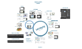
Transcript: Arrange your background boxes where you want them to be and position the titles of your boxes. Make sure your boxes are big enough so when you start coding the text boxes, when you start typing your text, that it is big enough to read. 5. The Layout Code (continued) 4. You can delete the text and type what you want according to your box title in which you will be typing under. Remember, do not delete all the text at once or the text box will disappear and you will have to recode that box. 5. On line five, </font></div> is the code that ends your text box (the code on line 2 is what starts your text box). If you want to add more boxes, and you have to code it with the same code used for the previous text box but with different values. 6. The </div> on line 6 means you have finished your layout. You cannot add any more code under that code or it will not appear. Example: Layouts Screenshot of Completed Layout 1. 3. 2. 4. Here is an example after finished customizing. (Remember, you can have more than one text box, as many as long as there is sufficient space.) Go to ribbet.com (ribbet isn't that useful anymore since it went freemium; creating an account won't work), or any other photo-editing websites, upload the image, and start customizing it. Add boxes (Stickers > Basic > Geometric) as the background for your actual text boxes. Rectangle works best. Direct Link Start Coding <div style="background: url('DIRECT LINK OF YOUR IMAGE HERE'); width: XXXpx; height: XXXpx;"> <div style="width: XXXpx; height: XXXpx; overflow: auto; text-align: XXXX; margin-top: XXXpx; margin-left: XXXpx; float: left;"> <font color="black" size="2" face="arial"> text text text text text text text text text text text text text text text text text text text text text text text text text text text text text text text text text text text text text text text text text text text text text text text text text text text text text text text text text text text text text text text text text text text text text text text text text text text text text text text text text text text text text text text text text text text text text text text text text text text text text text text text text text text text text text </font></div> </div> The End - Thank You For Your Attention! Choose a background image. Save it to your computer. Image Once you get your direct link, start coding on the w3schools tab. Here is the code (as you make more and more layouts, the code will start to stick in your mind and you won't have to refer to "how-to" sites anymore): Go to www.w3schools.com and on the homepage there will be a box that says "HTML Example." On the bottom of the box, click the button that says "Try it Yourself." The page where you land is where you start coding your layout. Delete the example code; you won't need that. Alignment Remember to give the proper credits too!!! In order to use your customized image as your background, you need to upload it to sites like TinyPic or Imgur to get a direct link otherwise your image won't show up and your code will be invalid. Start Coding Notes: 1. The width and height values on the first line is where you put how big your image is. You have to use the exact values or your code will not work. You can always refer back to Ribbet or the photo-editing site that you use for the width and the height. 2. The width, height is how big and how wide your text box will be. Keep in mind it has to fit into your background box. Text-align is whether you want your text to be to the left (recommended), right, or center. Margin-top is how far from the top your text box will be. Margin-left: how far from the left. 3. On code line 3, you can customize the font color, size, and font-family to anything you want. The Layout Code Choose a color for your text boxes and font styles (titles of your boxes). The titles can be anything such as About Me or News, etc. 6.

Effective Presentation Layouts

Transcript: Introduction to Presentation Layouts Presentation layouts are crucial for conveying information clearly and efficiently. They serve as a framework that organizes content, making it easier for the audience to follow and engage with the material presented. Effective Presentation Layouts A well-structured presentation layout is the key to effective communication. Presentation Expert Case Studies: Successful Layout Examples Examining real-world applications of effective presentation layouts and their impact on engagement and retention. 2018 2020 Company A implemented a new presentation layout that resulted in a 30% increase in audience engagement, showcasing the power of structured design. Company B redesigned their presentation layout, leading to a remarkable 50% improvement in information retention, proving layout's critical role in communication effectiveness. Strategies for Creating Clear and Engaging Presentation Designs Enhances Audience Engagement Grid Layouts: Organized structure A well-structured layout captures the audience's interest, encouraging them to engage with the content actively. This active engagement can lead to better understanding and interaction during the presentation. Freeform Layouts: Creative flexibility Types of Presentation Layouts Funnel Layouts: Focused content flow Roadmap Layouts: Strategic planning Improves Information Retention Proper layout helps in organizing information logically, making it easier for the audience to follow along. This structured approach increases the likelihood that key points will be remembered long after the presentation is over. Importance of Layout in Presentations Grid Layouts: Structure and Benefits Creates a Professional Appearance A professional layout conveys credibility and authority. It demonstrates that the presenter values the audience's time and aims for clear communication, ultimately enhancing the overall impression of the presentation. Clear Benefits Structured Organization Graphics Simplify Complexity Engaging Visuals Capture Attention Visuals Enhance Understanding The benefits of grid layouts include enhanced clarity and a professional appearance. They guide the viewer's eye, ensuring important information stands out, which enhances understanding and retention. Grid layouts provide a systematic approach, organizing content in a visually appealing manner. This structure allows presenters to arrange elements neatly, making it easier for the audience to process information. Guides the Viewer’s Attention Visuals can significantly improve comprehension, as they provide context and help in illustrating concepts that may be difficult to grasp through text alone. This enhancement leads to better engagement and retention of information. Using graphics allows for the simplification of intricate data or ideas. This method breaks down complex information into digestible parts, making it easier for the audience to follow and understand the main points. Engaging visuals capture attention and help maintain the audience's focus throughout the presentation. Effective use of images, videos, and infographics can create a memorable experience that resonates with viewers long after the presentation ends. A strategic layout directs the viewer's focus to critical information. By guiding attention where it is most needed, presenters can effectively communicate their messages and influence audience perception. Freeform Layouts: Creativity and Flexibility Freeform layouts provide a unique opportunity to break away from traditional structures, enabling presenters to express ideas in visually appealing ways. This format encourages innovation and allows for the integration of various elements to create a more dynamic presentation. Incorporating Visuals and Graphics Using Color and Contrast Effectively Best Practices for Text and Typography Incorporating color and contrast is crucial for enhancing audience engagement and information clarity. Implementing effective text and typography enhances clarity and engagement in presentations. 60% Text Limitation 40% of viewers are influenced by color Font Selection Bullet Point Usage Limit the amount of text per slide to avoid overwhelming the audience. Font Size Consistency Choose legible fonts that align with the presentation's tone and purpose. Use bullet points to break down information and enhance clarity. improvement in readability with high contrast Maintain consistent font sizes across slides to ensure readability.

Layouts

Transcript: Layouts I have placed a zapper code onto my front cover because I think that it will make my magazine more contemporary and appeal to the latest type of reader that is around at the moment. It will include extra content for them to be able to see on their phones. I think thought this was important to include this because my target audience are used to seeing these features on magazines that they are currently interested in. I have also placed my bar code down the side of Keane where there was a lot of blank space because I wanted to eliminate as much blank space from my front cover as possible because I saw what it looks like to have a lot of blank space on the front cover of B&S and I really didn’t like it. It looked dull and boring so I knew I wanted to ensure that there wasn’t much blank space on my cover. I also made it large so it is obvious to the potential customer how much the magazine costs. I wanted to do this because it is priced at roughly the same price as magazines that are currently available to the public. I have decided to put my text into boxes that are rotated to angle because I think it is intriguing to the consumer of the magazine. I also got the idea from MOJO’s cover but I have made this a more dominant theme on my cover than they have. I decided to do this because it eliminates a lot of blank space that would feature on the front cover otherwise. I have also changed what text goes with what text box. I decided to swap ‘Battle of the Contemporary Artists Inside!’ and ’10 Pages on Keane and His Lifestyle’ because I wanted to draw more attention to the content that is going to feature on my double page spread. I think it will get more attention in this text box rather than the one that it was previously in because it is singled out which will make it seem more significant to the reader rather than all of the headlines that are grouped together. Finally I have put the title of my magazine across the masthead. It is bold and it is also placed behind Keane. I have done this because it appears to the viewer of the image that the title was actually apart of the image that was taken and this is a good feature because it just simply makes the cover look professional. I added a slight shadow to my title to make it stand out and appear bold to the readers so that they remember the name of it and so that it stays fresh in their mind because of the 3D effect that it has. Finally I have gone with the colour gold to simply show to my audience that it is the best magazine for this genre of music. I have decided to design the layout of my front cover very similar to the front cover of MOJO. I have done this because I think that it is a very successful and engaging page for the audience. I have included images of stars on my cover like MOJO and Q because I think it is a very good way to represent how successful the genre of music it is but it also suggests how important the artist on the front cover is as well. The reason I have made my starts gold and not white or grey like Q is simply because I think the gold represents a more successful heritage of the genre of music. I made sure that I included a issue number and a release date of when this magazine was published. I did this because all big magazine production companies do this and it is also allows collectors or people who interested in this genre of music when it was released. It also eliminated some blank space of my cover but it is pointless context it has an reason for being on my front cover and that is important. I have sectioned my front cover into two and I have done this because I think it is a good way for me to show the audience the main artist that is going to feature in the magazine but also it allows me to add context on the cover as well which includes information about what will also feature in this issue of my magazine. I have used the rule of thirds when positing the artist onto my magazine this is important as it will draw attention to the artist which is the most important thing that features on my front cover. My layout is more like Q magazine and this is because it allows me to concentrate on more things which is important because the more interesting headlines that I can include on my cover. I haven't done it exactly like Q magazine though because one of the sections is over hanging on the image on the other section. I haven't copied this idea because I think that it looks amateurish.

Now you can make any subject more engaging and memorable