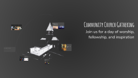
Community Church Gathering
Transcript: Understanding the Essentials of Church Poster Design Designing a church poster requires a deep comprehension of both the intended purpose and the target audience. This ensures that the message resonates effectively and engages the community. Community Church Gathering Verify Image Quality Proofread Carefully Choose Appropriate Paper Check that all images are high resolution and that colors match the intended design scheme. This ensures the final print will be vibrant and visually appealing. Inspect the poster for typographical errors, alignment issues, and overall design consistency. A thorough review helps ensure professionalism and clarity in the message being conveyed. Select the right paper type for printing, considering factors like texture, weight, and finish. The choice of paper can significantly impact the final appearance and durability of the poster. Final Touches Before Printing Join us for a day of worship, fellowship, and inspiration Church Name Incorporating the church name prominently establishes brand identity and ensures recognition among the community. Event Details Key Elements of a Church Poster Event details such as date, time, location, and description are vital for providing attendees with necessary information and encouragement to participate. Effective Layout Strategies for Church Posters Understanding the importance of layout in guiding viewer engagement. Call to Action A compelling call to action motivates the audience to take the next step, whether it's attending the event, visiting the church, or engaging in community activities. Initial Design Phase Element Hierarchy Visual Flow Final Review Start with a rough sketch to determine the placement of key elements, ensuring a logical flow of information. Establish a clear hierarchy by highlighting the church name and event details using size and contrast. Utilize visual elements such as lines and shapes to direct the viewer's attention across the poster. Conduct a final review of the layout to ensure all elements are balanced and effectively communicate the message before printing. Decorative Fonts: Style Over Substance Simple Fonts: Clarity First Decorative fonts can add a unique style and personality to a church poster, creating visual interest. However, they may reduce readability, especially from a distance or at smaller sizes, which can detract from conveying key messages. Simple fonts prioritize clarity and legibility, making them ideal for communication. They ensure that important information is easily readable at a glance, helping to attract and retain the audience's attention without confusion. Choosing the Right Visuals Quality Matters Reflective Imagery Emotional Color Use Ensure that visuals are high-resolution to maintain quality in print and digital formats, keeping the church's image professional. Images should reflect the church's values and mission, inviting the community to engage with the message. Colors evoke emotions and set the atmosphere; warm colors can create a welcoming feeling, while cool colors can convey peace.