The best presentations aren't one-way. The moment you can get a room, or a remote group, to actually respond to what you're saying, you get something a slide deck alone never gives you: a real read on what people think, know, or feel right now. That's the whole appeal of live polls and quizzes, and it's why more presenters are building sessions around real-time audience input instead of just talking at people.
But collecting that live feedback is only half the job. What you do with it afterward, how you turn a room full of live responses into something you can share, report on, or reuse in a completely different format, matters just as much.
What live audience engagement actually looks like
Real-time engagement works best when people can respond from wherever they are, right in the moment, without downloading anything or breaking the flow of the session. In Prezi, that looks like:
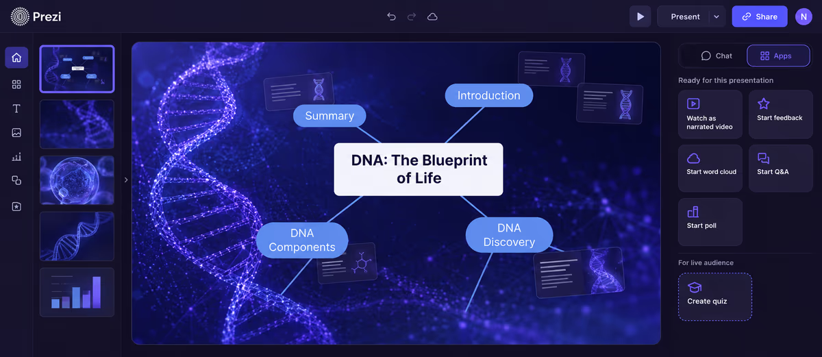
- Live polls, run directly inside a presentation, with results populating in real time as people respond from their phones. No third-party tool required.
- AI-generated quiz, which reads your slides and builds a quiz for your audience on the spot, useful for checking retention or just adding a bit of friendly competition.
These features are built around one thing: getting a real, visible response from your audience while you're still in front of them, not after the fact.
Getting that same content to people who weren't in the room
Live sessions only reach the people who showed up at that specific time. A growing part of getting value out of a presentation is turning it into something people can absorb on their own schedule, and Prezi AI has a few built-in ways to do that from an existing deck. Generate a narrated video takes your presentation and produces a fully narrated video version, with cinematic animation, transitions, and a voiceover, that you can edit and export as a standalone video file. Generate podcast does the audio equivalent, turning the deck into a podcast-style listen. Both can be edited before export, and a transcript is generated alongside them if you'd rather read than watch or listen.
That means the same core content you presented live, including a summary of what your audience told you through polls and quizzes, can be repackaged as a video or audio recap and sent to anyone who missed the session, consumed on their own time, or shared more broadly, without anyone needing to sit through the live event to get the substance of it.
Why the room's response is only step one
Once you've got live results, most presenters want to do more with them than just glance at a bar chart mid-session. They want to:
- Share a summary afterward with people who weren't in the room.
- Compare results across sessions, for example, the same skills self-assessment run with three different cohorts.
- Turn a single set of numbers into a different visual format depending on who's seeing it next, a recap deck, a report, a follow-up email, or a dashboard.
Sharing results with your team in Prezi
Adding a poll takes a couple of clicks while you're building the deck. From the slide menu, select Polls, then write your question and add as many options as you need, for example a simple multiple-choice question with four or five possible answers. That slide now carries a poll icon in your slide list, ready to go whenever you present.
When you reach that slide in Present mode, a Start poll button appears in the top right corner. Clicking it launches the poll as a live audience poll on the main screen, along with a join code and QR code. Your team or class navigates to the join link or scans the code, optionally enters a name to be shown with the results, and picks their answer. As responses come in, you can let them accumulate. Once everyone's had a chance to respond, click Close poll, and the view switches to live results: a chart showing exactly how the group answered, broken down by option.
That's usually the moment the interaction actually pays off: instead of hearing from the two people willing to speak up, you have a chart showing how everyone answered, and you can call on someone who picked an unexpected option to explain their thinking, or just ask if anyone's surprised by the spread.
After the session, that same presentation can keep working. Sharing the Prezi link lets your team revisit the deck, results and all, on their own time, and anyone using the "Explain it to me" feature can ask follow-up questions about specific sections without needing you in the room. Post-session analytics also show participation rates and results across the session, so if you're running the same set of questions with multiple teams or cohorts, you can compare how each group answered without rebuilding anything.
This is where the request for a "live radar chart" usually comes from. Someone wants to collect input across several categories at once (four skills, four product attributes, four criteria) and see it as a single shape rather than four separate bar charts. That's a legitimate need, and it points to something bigger than radar charts specifically: people want their live audience data to travel easily into whatever format tells the story best for the next audience, whether that's a chart, a report, or a video.
From live results to any format you need
The most reliable way to handle this today is to treat live collection and final formatting as two separate steps:
- Break your data into individual live poll questions. If you're after a four-axis comparison, run four separate scale polls (1 to 5, for example), one per variable, during your session.
- Run them live and talk through results in real time, question by question, while you have the room's attention.
- Capture the average score per question once responses are in.
- Reshape those averages into whatever format fits the next audience. For a radar chart specifically, a tool like Infogram works well: you enter your averaged data, it builds the radar chart, and you download it as an image to drop into a recap slide, a report, or your next session's opening. The same averaged data could just as easily become a simple bar chart, a one-page summary, or a slide-by-slide breakdown, depending on who's seeing it and why.
This two-step approach (collect live, then format for the audience that needs it) is really the underlying pattern for getting the most out of live audience data, whether the end format is a radar chart, a written recap, or a short video summary for people who missed the session.
FAQ
How do I get live, real-time feedback from an audience? Use live polls for structured questions (like a 1 to 5 rating), a quiz for testing retention or adding some competition, and a word cloud for open-ended reactions. In Prezi, all three run directly inside a presentation and update in real time as your audience responds from their phones.
Can I turn live poll results into a radar chart? Yes, but as a separate step after your session, not live. Radar charts compare several variables at once, so collect one live poll per variable (for example, four scale questions), then enter the averaged results into a chart tool like Infogram to build the radar chart. Download it as an image and add it to your recap or report.
Why isn't there a tool that builds a radar chart live from audience responses? Building a shape that updates continuously across multiple axes as responses come in is a much harder technical problem than a live bar chart or scale, which is likely why it's rare across audience response tools generally, and why Mentimeter removed its radar/spider chart option for Scales questions with no confirmed return date.
What's the best way to share live session results with people who weren't there? Capture the results while they're live (screenshots, exported data, or averaged scores), then reshape them into whatever format fits, a recap slide, a written summary, or a chart like a radar chart, bar chart, or infographic, depending on what best tells the story for that audience.
Does Prezi have a radar chart feature? Not currently. Prezi's strength today is live audience interaction: real-time Polls, Quiz, and Word Cloud. For turning results into a radar chart afterward, a dedicated tool like Infogram is a solid option in the meantime.
What is a radar chart used for? Comparing three or more variables against each other so patterns, gaps, and outliers show up in a single shape rather than a table of numbers. It shows up across a range of contexts: sports and performance analysis, product or service comparisons in business reporting, research and academic work comparing experimental variables, and team or personal skills assessments in training and education settings.
What's the difference between a radar chart and a bar chart? A bar chart is easiest to read one variable at a time. A radar chart plots every variable on its own axis around a shared center point, so the connected shape shows the overall balance across all of them at once, useful when you care more about the pattern across categories than the exact value in any single one.
How do you read a radar chart? Each axis radiating from the center represents one variable, with values increasing the farther a point sits from the center. A data point is plotted on each axis at the value it received, and connecting those points draws the shape for that data set. A shape that reaches far out on some axes and stays close to the center on others shows where something is strong versus where it's weak. When two or more shapes are plotted on the same chart, overlapping areas make it easy to compare data sets directly.
What are the advantages of a radar chart? It condenses several separate numbers into a single shape, which makes comparative discussion faster than reading a table or a set of individual bar charts. It's particularly useful in group settings like reviews, evaluations, or workshops, where people are discussing trade-offs across categories rather than optimizing for one number.
Is a radar chart the same as a spider chart or web chart? Yes, radar chart, spider chart, and web chart all refer to the same visualization. The name varies depending on the source, but the structure, axes radiating from a center point with data points connected into a shape, is identical.