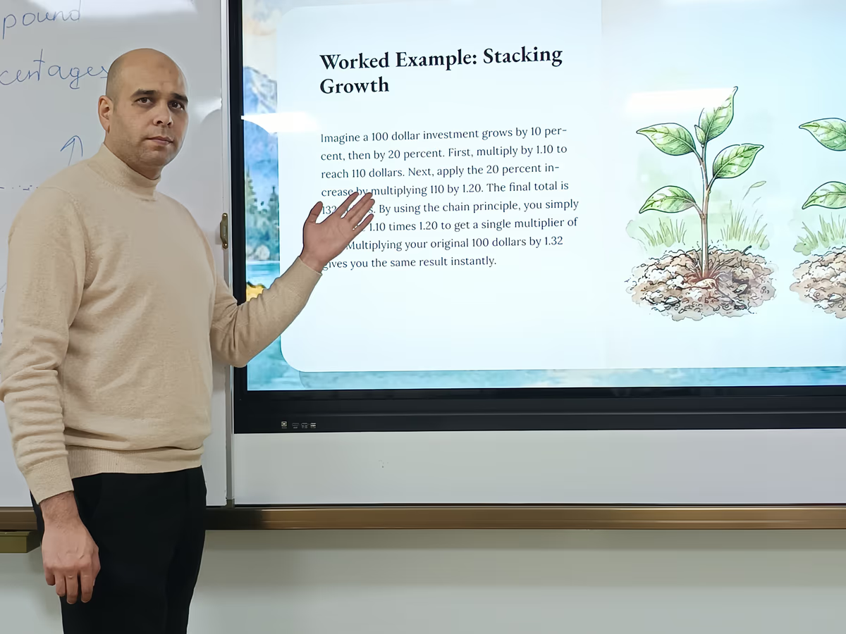
90% of the information we take in comes to us through our eyes, so it comes as no surprise that imagery in a presentation leaves a more vivid and memorable impact than text. The simplicity of a picture or two can convey a message far beyond its intended meaning far more than a page of writing can. And powerful visuals can help you connect ideas that your audience may not have connected before, inspiring new trains of thought altogether. When talking about a complex idea, the best presenters don't rely on technical jargon to express what they mean; they let the graphics do the talking. This technique communicates ideas in a cohesive and in-depth manner without being overwhelming, allowing audiences to not only remember what was said, but understand it better as well.In our e-book, “Presentation Design 101,” we've boiled down the basics for incorporating appealing and user-friendly graphics that will help you organize and communicate your presentation effectively. This e-book is for anybody to use, regardless of how much experience you have with graphic design.
Download it today to learn:
- Why using visuals can be more effective than wordy descriptions
- How to make your numbers pop with simple tactics for data visualization
- What you can do to customize the look and feel of any presentation
[pardot-form id="10376" title="2016-06_BlogEbook_Presentation-Design-101"]