You're about to create your best presentation ever

Ux Modera Presentation Template

Create your presentation by reusing one of our great community templates.

UX Presentation

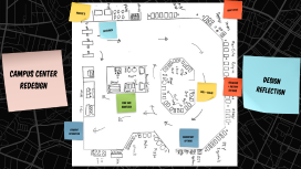
Transcript: Campus Center Redesign Design Summary Redesign CC - cafeteria + surrounding seating - Accommodate for Muslim students coming out of MENA - Accommodate individuals with OCD Creating a more structured and quality CC experience Cafeteria + Silent room PLan Floor Plan Keep the dimensions of the cafeteria Create a window barrier for silent lounge currently microwave lounge Entrance Entrance Add trays so less balancing multiple plates Move silverware to beginning Widen stalls for wheelchair to fit Deli + Salad Deli + Salad Section Combining Salad and Deli - Both self serve centric - Making containers smaller for fresher ingredients - More spaced out containers, so food doesn't mix - Improves flow of cafeteria Religious + Dietary EntrEes Religious Dietary EntrEes Adding more options for those with diet restrictions - Halal station - Separate allergy+gluten section - Vegetables and dairy products in other sections are Halal - Incorporating Middle Eastern Foods - Clearly labeled signs consistentOptions consistent Options Always available options: pasta and pizza, and do it yourself station - always have something to eat - OCD finds it hard to get out of certain routines Food scale - could be important in OCD to eat specific amounts Sink and SanitiZer Santization STation - hand sanitizer at front of every station - sink for dishwashing and handwashing purposes in the front by plates and by the DIY station - OCD make manifest in many ways, and one of these is extreme fear of germs Student Interation Student EngageMent Adding a white board to write ideas for food - Students can suggest foods that they want - Help engage international students - Help neurodivergent students suggest safe foods Roscoe's Roscoe's Open at night during Ramadan - a month when Muslims are to refrain from eating/ drinking from dusk to dawn - Open for a few hours at night during the duration of Ramadan Quiet Space Quiet Area Making the hallway a quiet area - Can be overwhelming to be in such a crowded and noisy space, even for students without OCD - Behind this quiet area is the current chapel, which will help students focus on their prayers Layout - Silent gateway to chapel - Private booths for eating - Silent, predictable environment for OCD - Natural light + silence + plants A glass door that makes this area seem slightly separate. Sound panels on wall that absorb sound Calming color scheme Seating where you can sit alone, or with others Design Reflection Design process reflection Design based on peer feedback: - Trays - Utensil stations at begining and end - Distinct allergy and vegan sections - Emphasis on self serve Global Design Framework What makes this design usable? - Better cafeteria flow, sanitization, access to food What makes the design useful? - Increased options, trays, and better deli What makes the design engaging? - Quiet space, student voting Thank You!

UX Presentation

Transcript: 50% Who is Involved Recruiting users Screeners Demographics (location, age, gender, level of industry and/or technical expertise) Task failure/success Task completion time Number of errors Number of clicks Analysis Report Recommendations Other Tools 50% "I invented the term because I thought Human Interface and usability were too narrow: I wanted to cover all aspects of the person's experience with a system, including industrial design, graphics, the interface, the physical interaction, and the manual." - Don Norman Real scenarios/tasks Purchase a round-trip flight to Paris Find a gift for your niece and have it arrive on her birthdate Find college savings plans on a website :) Low-fidelity prototype High-fidelity prototype Paper, wireframe/visualization tool Photoshop, HTML/CSS Paper Prototypes Participant Moderator “Computer” Note-taker Observers A|B Multivariate Testing (MVT) Advantages User Experience 1993 1:10:100 Testing Labs # of Users % of Usability problems found UX definition DON NORMAN "User experience," often referred to as UX, encompasses all aspects of the end-user's interaction with the company, its services, and its products. - Nielson Norman Group UX in practice Measurable Metrics Task Examples Post-Test Prototyping Post-Development Visitors to your website How Many Users? Almost 50% 90% Diminishing returns with additional users. Inexpensive Fast Easy to iterate Avoid look-and-feel feedback Avoid design attachment What is it? Surveys Interviews Diary Studies Product Reaction Cards User Testing 80%

UX Presentation

Transcript: some helpful content hard to find security 1024 x 768 search could be more helpful some products are not available on-line and it is not clearly indicated UX Review of IKEA.com website UX Best Practices appropriate help to eliminate extra time dealing with wrong turns help with planning weakness gallery of ideas pressed for time easy to navigate some products not available on-line - and not clearly indicated UX Heuristics Mapping upselling and cross selling posibilities commonalities inexpensive but high quality solutions easy and clear ordering process weakness small business owners Weaknesses young families 1268 x 768 strength weakness E-Commerce Best Practices IKEA - customer/user profile navigation within products clear path to product information IKEA.COM New and Improved search could be more helpful college student willing to deal with minor inconvenience to get best value gallery of ideas forms don't have example text in fields UX Site Review UX Site Review - how does it measure up? simple registration ease of product navigation support key user actions with minimum clicks weakness page layout is not liquid helpful content hard to find inspiration DIY'ers Strengths weakness optimize page layout more common resolution indicate on first product placement when not available for purchase on-line easy ordering process weakness strength page layout is not liquid, and doesn't indicate there is anything beneath fold add helpful hints to search, when no results found easy and clear ordering strength move link to design tools to top navigation

Ux presentation

Transcript: Product Objective? "To Provide a Platform for companies to interact with customers" User Needs ?? "Find a place to chat to companies rather than wasting time on phone calls" The Skeleton Plane iHelp The Surface Plane Stratergy Plane Brand Identity Information Architecture Fairly Comfortable with computers/ 100% Internet Usage at Work / The Scope Plane We have stick to our core stratergy and eliminated ideas people gave during testing We have removed a lot of clutter We kept our Navigation very simple Rather than adding things as widgets we kept them constant Automated Testing We employed Selinium Testing Content The Structure Plane Gim/ 45/ Software Dev Manager 9Am-5Pm / Married/2 Children Fav Sites: Amazon, Ebay, Quora, Stack over Flow ● Ability to live chat with the customers ● Can remotely view the desktop of the customer representative "Customers from all the demographic areas tired of wasting time on long hold times to call companies" Our Team Questions? Anudeep Dasari, Developer Bhavya Vasireddy,Developer & Usability Tester Anudeep Chimakurthi, Developer Card Sorting Navigation Systems Testing Planes of Design Card Sorting Testing User Segmentation Before and After Testing Persona 1 Agenda User Experience Design and Testing Functional Requirements ? We chose colors to be bright and energetic We had a Grid based layout Many of the features were inspired and some we created to enhance the UX We generate FAQ’s from chats with the customer care ● We add the value to the product's from company by collecting content from the users

UX presentation

Transcript: UX Development Services User Experience Introduction The UX Professionals Dave Shaykewich | Team Lead, UX & Front End Web Andrew Jung ('drew) | Information Architect Faye Hoffman | Sr. Information Architect Maria-Elena Froese (Maleh) | Information Architect Selina McGinnis | Functional Analyst Overview The Developers Craig McNaughton | Programmer Analyst Olivia Prior | Programmer Analyst Ray Choo | Sr. Software Developer Who we are The UX/Dev team Why we do it Strategy What we do Services How we do it Methodology Our Leader UX Strategy Strategy building solutions with the client (business) and customer (user) in mind improving the quality, productivity and satisfaction of people's study and work lives validating solutions through real customer feedback iterating upon solutions to ensure the final solution will work well for the people who will use it UX Strategy - Opportunity Create a formal UX strategy principles service offerings methodology A Project Charter is being developed Distribute and evangelize the value and benefits of UX work: Increased customer satisfaction Increased productivity Improved recruitment and retention efforts Decreased training and support costs Reduced development time and costs Reduced maintenance costs UX Context Involving UX professionals Why we should What can happen if we don't Services UX Services Researching, defining and user testing the navigation, organization and user interaction of the system. To ensure our solutions are useable and useful for our clients and their users. Support the strategy & development of solutions; User Research Planning PLANNING Requirements Elicitation Business Process Mapping Understanding user behaviours, needs and motivations through observation techniques, task analysis and other feedback methodologies. Gathering and analyzing user and business needs for the solution is an integral part of information systems design, critical to the success of interactive solutions. Assisting your organization in becoming more effective, through clear and detailed business process map or diagrams identifying whether or not improvements can be made to the current process. What are our client's and user's motivations and needs? Talk to users Understand processes Elicit requirements Identify opportunities Scan the environment Understand motivations Information Architecture Design DESIGN Interaction Design Focuses on organizing, structuring and labeling content in an effective, consistent and sustainable way. The goal is to help users find information and complete tasks. Create engaging interfaces with well thought out behaviours. Understand how users and technology communicate with each other Anticipate how someone might interact with the system Fix problems early Invent new ways of doing new things Provide consistent ways of doing familiar things We create solutions which meet those needs. Identifying actions and context Breaking down complexity Modelling solutions Creating consistency Prototyping solutions Heuristic (Expert) Evaluation Evaluation EVALUATION Usability Testing Unlike interviews or focus groups which attempt to get users to accurately self-report their own behaviour or preferences; Detect problems with ease of use Measure actual performance on critical tasks A usability inspection method that helps to identify usability problems in the interface (UI) design. Experts examine the interface (low to high-fidelity prototypes) Judge compliance with recognized usability principles We determine if the solution meets expectations. Standards review Watching and listening Confirming supposition Artifacts & Analogies Business opportunities identification Business process discovery, maps & diagrams Card sorting CMS content model Competitive review Content inventory Content maps Heuristic evaluation Interaction design patterns & guidelines Journey and service mapping UX artifacts & analogies Online surveys & reports Paper & 3D prototyping Persona development Requirements analysis Site architecture map Usability & focus groups Use cases & context maps User analysis & reporting User flow diagrams Wireframes Elements of User Experience ~ Jessie James Garrett UX as the blueprints for clients and developers The UX Toolbox Collaboration opportunity Developers Subject matter experts Users Stakeholders Methodology Methodology What does a UX process look like? Plan Research Observe Understand Analyze Design User artifacts Business processes Wireframes Maps Develop Solution delivery Communicate Monitor Refine Deploy Usability testing User acceptance Quality assurance Approval Elicit requirements and domain details from users/customers and stakeholders Collect existing business and/or user research data Analyze and compare user needs with business goals to identify opportunities Develop, communicate and iterate upon a solution plan with stakeholders and development team Create information architecture artifacts: user experience and business process maps, use case Q&A Q

Now you can make any subject more engaging and memorable