Company Template Presentation
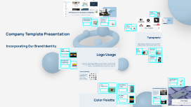
Transcript: Purpose of the Template Introduction to Company Template Image Guidelines The company template serves as a foundational framework for all our communications, ensuring that every document reflects our brand identity. It enhances professionalism and establishes a cohesive presence across various platforms and materials. This section outlines the significance of our company template and provides a foundation for understanding its key components, emphasizing how a well-structured template aligns with our overall branding strategy. Images must align with brand values and messaging. Use high-resolution images, and ensure they comply with copyright regulations while representing diversity and inclusivity in visual storytelling. Importance of Consistency Icons and Graphics Overview of Branding Elements Icons simplify complex ideas, providing a visual shorthand that enhances understanding. Ensure icons are consistent in style, color, and sizes to maintain a cohesive look across all materials, reinforcing brand recognition. Key branding elements like logos, colors, and typography are integral to our template. These elements work together to convey a unified brand message, fostering recognition and connecting with our audience on multiple levels. Maintaining consistency across all brand materials is vital for building trust and credibility. A uniform approach to design and messaging enhances brand perception and ensures that our audience receives a cohesive experience. Design Templates Visual Elements Templates streamline the design process, ensuring consistency across presentations and documents. Utilize established layouts and style guides to maintain brand integrity and save time on future projects. Visual elements are crucial in conveying a company's identity and enhancing brand recognition. Effective use of icons, images, and templates contributes significantly to communication clarity and visual appeal. Company Template Presentation Typography Typography shapes our communication and influences how messages are perceived. Effective use of font styles, hierarchy, and accessibility ensures that our content is engaging and readable across all platforms. Incorporating Our Brand Identity Accessibility Considerations Font Styles Logo Specifications Accessible typography ensures that all individuals can engage with our materials. Use legible fonts, adequate contrast, and responsive sizing for various devices to enhance usability for everyone. Consistent font styles improve brand recognition and lend credibility to our communications. Select fonts that align with our brand identity, ensuring readability and aesthetic harmony in all materials. The logo should consistently represent the brand’s identity, adhering to specified dimensions, colors, and design elements. Ensure that the logo is not altered in colors or proportions to maintain visual integrity. Logo Usage Heading vs. Body Text Headings should be bold and concise, guiding the reader through content. Body text should be clear and readable, balancing aesthetics with functionality to maintain audience engagement. Placement Guidelines Consistent logo usage strengthens brand recognition and fosters trust among customers. Adhering to specifications and guidelines ensures the logo is presented effectively across various platforms. Proper placement of the logo enhances visibility and impact. Always place it in prominent locations on materials such as websites, presentations, and marketing collateral following the defined spacing and margins. Size and Scaling Maintain the logo's clarity by adhering to specific size guidelines. Avoid shrinking or enlarging the logo excessively, as this can distort its appearance and compromise brand identity. Digital and Print Applications Our template is adaptable for both digital and print media, ensuring seamless integration across platforms. This flexibility allows for effective campaigns in social media, websites, and printed brochures alike while maintaining brand integrity. Color Combinations Secondary Colors External Marketing Materials Effective color combinations can significantly impact design perception. Optimal pairings like blue with gray or green with orange not only ensure visual harmony but also strengthen brand messaging and recognition. The secondary colors include orange and gray, adding warmth and neutrality to our palette. Orange evokes enthusiasm and creativity, while gray provides balance and sophistication, enhancing our overall aesthetic. The template is essential for creating external marketing materials such as brochures, flyers, and presentations. Consistent use of branding elements enhances credibility and the effectiveness of marketing strategies. Primary Colors Internal Communications Our brand's primary colors are blue and green. Blue symbolizes trust and professionalism, while green signifies growth and vitality. These colors serve as the foundation for our visual identity, ensuring consistency across all


