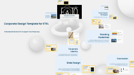
Corporate Design Template for ETEL
Transcript: Importance of Corporate Design Effective corporate design fosters brand recognition and trust. By maintaining visual consistency, ETEL ensures that its messaging aligns with its values and mission, ultimately enhancing customer loyalty and market position. Maintaining Simplicity in Design Simplicity enhances comprehension and retention. Focus on a clean, uncluttered design by limiting text and utilizing white space effectively. A straightforward presentation aligns with ETEL’s branding, ensuring that the essence of the message remains clear. Overview of European Tyre Enterprises Visual Impact Strategies Introduction to ETEL Creating Visual Hierarchies ETEL is a leader in the tyre industry, providing innovative solutions tailored to customer needs. Established with a focus on quality, the company integrates advanced technology in manufacturing processes to enhance performance and safety. Effective visual communication enhances audience engagement and understanding. By employing strategic use of imagery, establishing clear visual hierarchies, and prioritizing simplicity, presentations can make a powerful impact while conveying the intended message succinctly. European Tyre Enterprises (ETEL) specializes in the production and distribution of high-quality tyres for various vehicles. Corporate design plays a pivotal role in establishing a strong brand identity and ensuring consistency across marketing materials. Visual hierarchies guide the audience's focus, highlighting the most important information first. Utilize varied font sizes, colors, and layouts to create distinct levels of information, helping viewers navigate content efficiently while adhering to ETEL’s design principles. Use of Imagery Incorporating high-quality, relevant images can evoke emotional responses and reinforce the message. Visuals should complement the content rather than distract, ensuring they align with ETEL’s corporate identity and enhance understanding of key concepts. Corporate Design Template for ETEL Colour Application The color palette of ETEL embodies its identity and fosters recognition. All designs should utilize approved colors to ensure consistency and emotional resonance in branding. A Standard Slide Deck for European Tyre Enterprises Logo Usage Rules Colour Scheme Proper logo application is vital for brand integrity. This includes maintaining space around the logo, using it in its designated colors, and avoiding alterations that could distort its message. Branding Guidelines ETEL's corporate colour scheme consists of a primary palette that includes deep blue and vibrant orange. These colours are strategically chosen to evoke trust and energy, ensuring that all branded materials reflect a cohesive and appealing look. Consistency in Design Typography A coherent branding strategy is crucial for maintaining corporate identity and building trust in the market. Adhering to consistent design elements enhances recognition and reinforces the brand's presence. Maintaining uniformity across all materials ensures that the brand is easily recognized. Consistent layouts, typography, and imagery create a cohesive experience that reinforces corporate identity and professionalism. The typography used by ETEL features a clean, sans-serif font that enhances readability and modernity. Consistent font usage across documents and signage reinforces the brand's identity, ensuring all communications maintain professional integrity. ETEL Logo The ETEL logo is designed to project professionalism and innovation, featuring bold typography paired with minimalistic symbols. Its versatility allows it to be prominently displayed across various platforms, reinforcing brand recognition among stakeholders. Corporate Identity Corporate identity encapsulates the visual and emotional attributes of ETEL, creating a distinct brand presence. This section highlights the key elements that communicate the brand’s values and style effectively. Conclusion Recap of Best Practices Slide Design This section wraps up the key design principles established for the ETEL presentation template, emphasizing corporate identity, visual impact, and adherence to branding guidelines. Key practices include maintaining consistency in logo and color usage, designing visually appealing slides, and ensuring simplicity to enhance communication. These elements are crucial for a cohesive corporate identity that resonates with the audience. Title Slide Layout Call to Action for Design Adoption Effective slide design enhances communication and engagement for audiences. A well-structured slide deck reflects the corporate identity of ETEL while ensuring content is clear and visually appealing. Future Design Considerations The title slide serves as the first impression. It should prominently feature the ETEL logo, the title in corporate colors, and a clean layout that avoids clutter, establishing a professional tone for the presentation. Implementing these design practices requires commitment