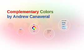
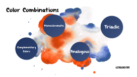
Complementary Colors
Transcript: Example/Diagram -BobDavies88. "Watercolor Basics - Understanding the Color Wheel and Complementary Colors." YouTube. YouTube, 17 June 2009. Web. 03 Oct. 2012. <http://www.youtube.com/watch?v=31HfW8H1DdU>. -"Color Harmonies." : Complementary, Analogous, Triadic Color Schemes. N.p., n.d. Web. 03 Oct. 2012. <http://www.tigercolor.com/color-lab/color-theory/color-harmonies.htm>. Thank you -"Intro to Color Theory." YouTube. YouTube, 31 Jan. 2011. Web. 03 Oct. 2012. <http://www.youtube.com/watch?v=059-0wrJpAU>. -"Explore Cornell - Home Gardening - Using Color in Flower Gardens - Color Complements." Explore Cornell - Home Gardening - Using Color in Flower Gardens - Color Complements. N.p., n.d. Web. 03 Oct. 2012. <http://www.gardening.cornell.edu/homegardening/scene638f.html>. By: May Lin Complementary Colors Bits on color mixing 1:12-1:36 6 seconds on complementary colors 3:00-3:06 Complementary colors are directly opposite from each other on the color wheel. Complementary colors have a high contrast when put together, creating a vivid scheme. This color scheme can be distracting to the eye if not managed well. Red flowers look eye catching and brighter when put against green leaves for background. Because complementary colors can intensify each other. starting from 1:03-2:47or 3:40(if you want to learn more about how complementary color work with each other) Citations: Definition: Colors that are directly opposite to each other on the color wheel are considered to be complementary colors, such as red and green or yellow and purple. When combined in the right proportions, these complementary colors produce white light. Or creates a neutral color in between the two opposite colors. What is complementary color? Video&Questions